
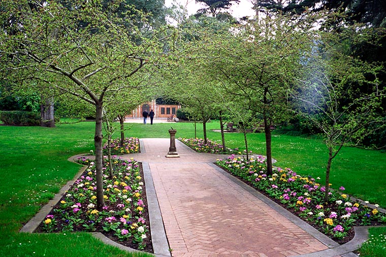
Garden Gate, Bessa R, CV 35mm f2.5, Kodak UC100

This shot had the flare spot too, but I cleaned it up a bit with Photoshop.
-- Warren
posted by Warren T. at 11:28 PM
4 comments
![]()
![]()
We are a small group of friends with a common love of photography. We hope to enjoy each others' work and to broaden our knowledge of photography and to stimulate our creativity by sharing our work and ideas here. Please invite your friends to stop by. If you are interested in becoming a photo contributor, please send me an email. --Warren
posted by Warren T. at 11:28 PM
4 comments
![]()
![]()
posted by Warren T. at 11:21 PM
0 comments
![]()
![]()
posted by Warren T. at 11:13 PM
4 comments
![]()
![]()
 SteveR said...
Wow! Are you sure that's not a Summicron you mounted?? :-)
Beautiful photo - great colors and very sharp
Warren T. said...
Thanks Steve. Of course, it's still a little earlier to have a firm conclusion, but for now, I would have to say that I'm more impressed with the J-8 then the CV 35mm Skopar. I think the Skopar needs to be stopped down to get max performance. I'll need further testing to be sure though.
martin said...
I suggest you shoot more with the Jupiter 50mm. I'm using a 50mm more. The 35s and 28s are good but I tend to get too much information in the frame and more depth of field.
Warren T. said...
This is SO interesting! I've been thinking a lot about this lately. I've also been favoring the 50mm focal length lately. It's back to the future because my very first serious camera, my old Nikomat FTn came with a 50mm f1.4, and that was around 35 years ago!
-- WT
posted by Warren T. at 11:05 PM
0 comments
![]()
![]()

posted by Warren T. at 7:20 AM
0 comments
![]()
![]()
posted by Warren T. at 8:08 AM
2 comments
![]()
![]()
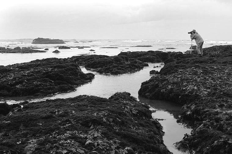
Warren T. said...
This guy was braving the wind and cold to get some telephoto shots of some sea lions lying around on some rocks offshore.
As photographers, can you relate to this picture?
Does the composition do anything for you? I thought the x-shaped tidepool in the foreground made it interesting.
--Warren
SteveR said...
I agree that this makes a really good B&W image - the B&W tones allow the composition to take precedence. The x-shaped tidepool - a good catch, Warren.
posted by Warren T. at 7:45 AM
4 comments
![]()
![]()
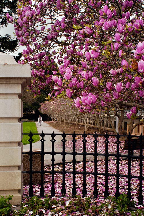
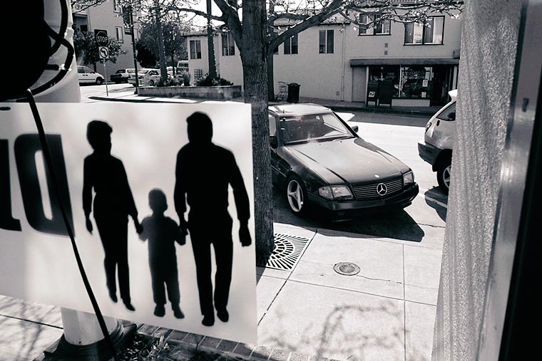
Warren T. said...
I'm very interested in reading discussion about this. A friend answered offline that he thought the shot was good, but a little "busy". He offered that perhaps a closeup of the blooms would be better. I think that yes, a closeup of the blossoms would be a picture of some blossoms, but in my opinion, that's too common a shot.
That's why I brought up the subject of spring blossom shots recently. I find it challenging to make a "different" image. In this one, I felt that the gate in the foreground, and the man walking on the path, adds balance and context to the shot. In my previous cherry blossom pictures, I would shoot just the tree and the blossoms, but to me, that kind of shot doesn't hold enough interest.
Still curious as to what the group thinks.
--Warren
martin said...
I gave this photo some thought and although the color is nice the picture does not hold up because of the black fence and the white column on the left. These elements detract from the color of the blossoms. I heard in a color class that significant areas of neutral colors such as black, white and gray basically lessens the effect of color in a photo. If you had more of the green grass and eliminated the fence and column the photo has a chance of working as green and magenta complement each other.
I have problems doing color myself as my training is in black and white. A lot of times when I look at a scene, I tend to look for the quality of light, form and composition rather than color. Maybe you are expecting too much, grab shots are hard to do and even more difficult in color.
Warren T. said...
Martin, thanks for your very interesting comments about color harmony. It's very thought provoking.
It's interesting that you think the shot failed based on analysis of the color. This is a concept that I have not thought much about lately(but probably should).
As for grab shots, that's a genre of photography that I find fun and interesting. The challenge is to get the best composition given the circumstances and timing. I don't expect that all grab shots will work, but when they do, it's very satisfying.
Warren T. said...
Previously, I said, "This is a concept that I have not thought much about lately(but probably should)."
What I meant to say was that I didn't really look at this particular shot in that way. Gee, does that make sense?
I would love to hear from others about this.
--WT
posted by SteveR at 6:29 AM
1 comments
![]()
![]()
posted by Unknown at 7:51 PM
1 comments
![]()
![]()
Warren T. said...
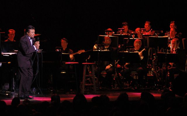
That's a nice shot given the difficult conditions. My wife and I went to his last concert in S.F. You captured the ambience of the event very nicely. I liked the fact that the audience can be seen at the bottom of the shot. It looked like he was slowly walking to his left. It would have been nice to have waited until he strolled in front of the black spot in the background. When you snapped this shot, there was some distracting objects behind his head. Also, since he is so far to the edge of this shot, the band is almost too dominant, making the shot more about the band, than about Johnny Mathis.
What ISO were you shooting at?
-- Warren
posted by Unknown at 6:42 PM
7 comments
![]()
![]()
Warren T. said...
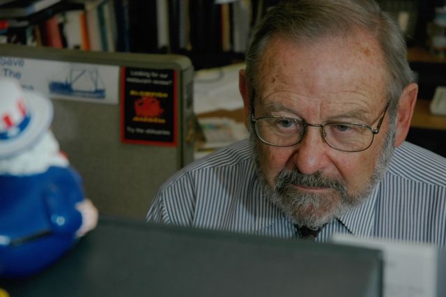
Thanks for posting Tony! The more I look at this picture, the more I like your composition. The shape and angle of the monitor in the foreground matches the shape and angle of the cubicle wall in the background. Mr. Nolte is perfectly positioned between these two elements. You also left enough of the background in place to establish that the subject was in his element (in the office). There's also very nice focus control, tack sharp on face and eyes, and everything else unobtrusively out of focus.
The lighting was also nicely done. There's just one thing that I want to note: I'm not sure if you intended it this way, but the image as a whole is a little dark on my screen. It could be brightened just a little bit.
-- Warren
Warren T. said...
Tony, you probably need to calibrate your monitor(s). I just did a very quick search and found this page where you can read about it... http://epaperpress.com/monitorcal/
Benson said...
This is one of those shots you see in the newspaper or magazine that captures the essence of a story. It's a great shot that captures the main person in the story (I would assume) in his working environment. Just enough of the background and foreground is shown to reveal his office but it is out of focus enough to not distract from the main subject, Mr. Nolte.
martin said...
I disagree with Benson. I know Nolte from my days at SF State. I would not have photographed him at the paper. You should have taken him somewhere in the to associate him with San Francisco. Perhaps I have background information you are unaware of, but I would have done a little research on the subject. This is a photojournalism assignment, you and others here are a bit caught up with the technical aspects of photography.
Warren T. said...
Martin,
Ouch, that was harsh, dude!
You have the benefit of having background information. I'm not familiar with the guy, so basically what I have left to comment on is my opinion of the composition and technical aspects of the image.
I loved your comment with the inside information, and for those shots that are supposed to be PJ style, we can really use your expert opinion.
--Warren
martin said...
Hmm, a bit harsh? If I was a photo editor at a newspaper or magazine, I would have made the exact comments that I did.
We are all still learning, and we learn best by shooting more. Sometimes the photos work and sometimes they don't.
Warren T. said...
Point taken. But remember, we don't see the smile on your face when reading the comments online :).
Don't change a thing Martin, just keep commenting!
--WT
posted by Warren T. at 10:53 PM
3 comments
![]()
![]()
Benson said...
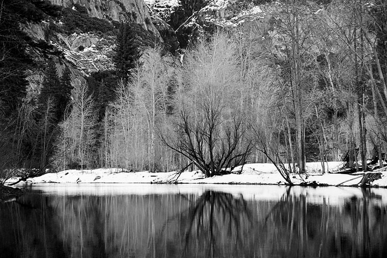
I would have to say I'm surprised that there are no additonal comments on this shot. I really like this one. I like the Ansel Adams-esque nature of the shot and the detail of the mountain in the background. The contrast of the snow and the trees and rock structure works well also. Great shot!
SteveR said...
Yes, I agree with Benson, and I would have to use just about the same words - Adams-esque, etc.
Wonderful.
Warren T. said...
Thanks guys. It really means a lot to me when I get feedback (any kind, good or bad, it doesn't matter). I personally think that this is one of the best B&W pictures that I've ever made, and it's nice to know that someone else likes it too :)
Whenever things get rolling on FPCF, I get all pumped up and then I post too many pictures to FPCF. Maybe I should stop and let you guys post for a while.
-- Warren
posted by Warren T. at 7:54 AM
4 comments
![]()
![]()
Warren T. said...
So, did this picture do anything for anyone? Or is it just too gimmicky and not worthy of posting? I thought it was cool, but it appears I may be the only one who thinks so :).
As you probably noticed by now, my subject and styles are all over the map. It's interesting for me to see which shots get a reaction and which are ignored.
-- Warren
Benson said...
Sorry to say this picture did not do anything for me. That's why I did not comment on it.
Warren T. said...
Thanks Benson. No need to be sorry about it. We can't expect all our pictures to appeal to everyone.
It would be great to know why it didn't do anything for you. Was it because you simply weren't interested in the subject or style (i've heard this from others before)? Was it the composition? If so, how can it be improved? Would it work better in color?
-- Warren
martin said...
I find this photo interesting. I look at it and it makes me think about what is going on in the scene. It is very different than other photos you make. I like the way the camera is tilted slightly down creating horizontal and vertical lines that are off axis. You should try to experiment more like this. Perhaps shooting with a rangefinder camera would change the way to look at scenes.
posted by Warren T. at 11:05 PM
1 comments
![]()
![]()
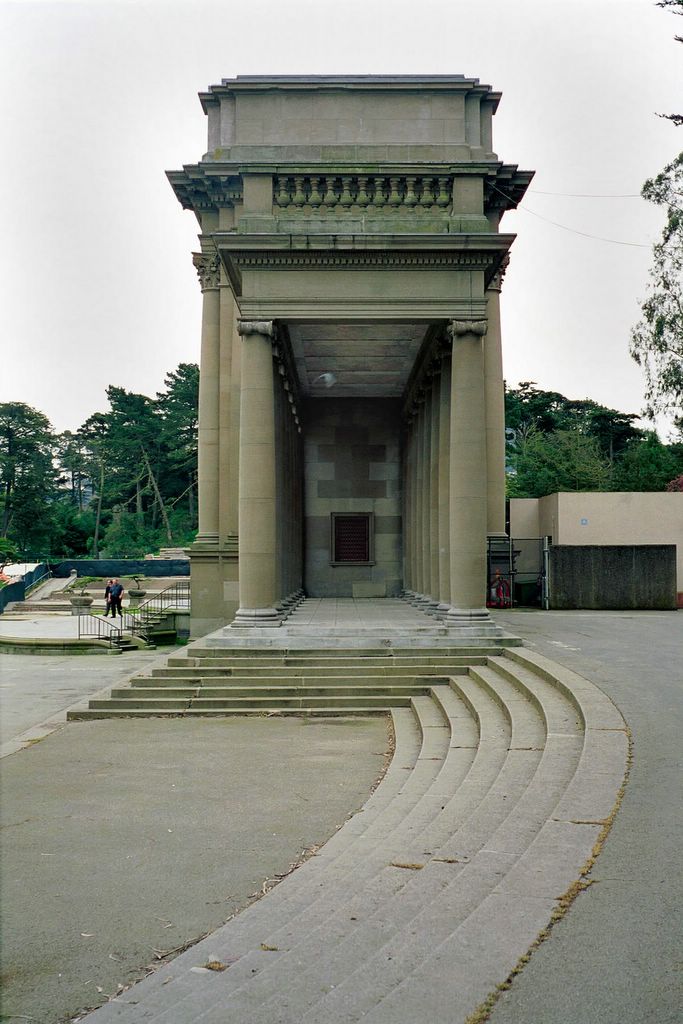
Benson said...
I like this photo for its unique perspective and symmetry. Maybe being a dentist has really brainwashed me into appreciating symmetry.
posted by Warren T. at 7:50 AM
0 comments
![]()
![]()
posted by Warren T. at 10:58 PM
2 comments
![]()
![]()
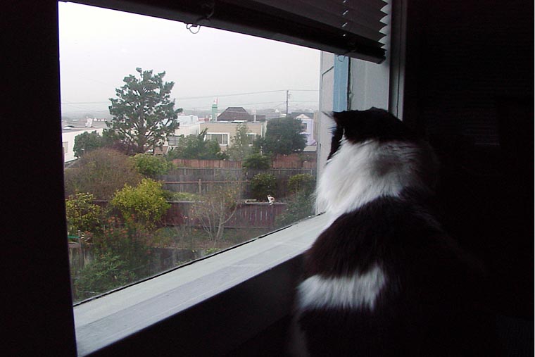
SteveR said...
Very cool! I like the way you have a monochrome "frame" with the inside, including your cat, surrounding the color outside view. I also like the way you turned the window into a trapezoidal shape - it leads the eye to the cat.
Warren T. said...
Thanks.
Did you notice that outside cat? :)
Correction: The DSC-D770 has a mirror, but it's fixed, so no mirror slap & vibration to deal with.
-- Warren
posted by Warren T. at 9:41 AM
5 comments
![]()
![]()
Dennis Fong said...
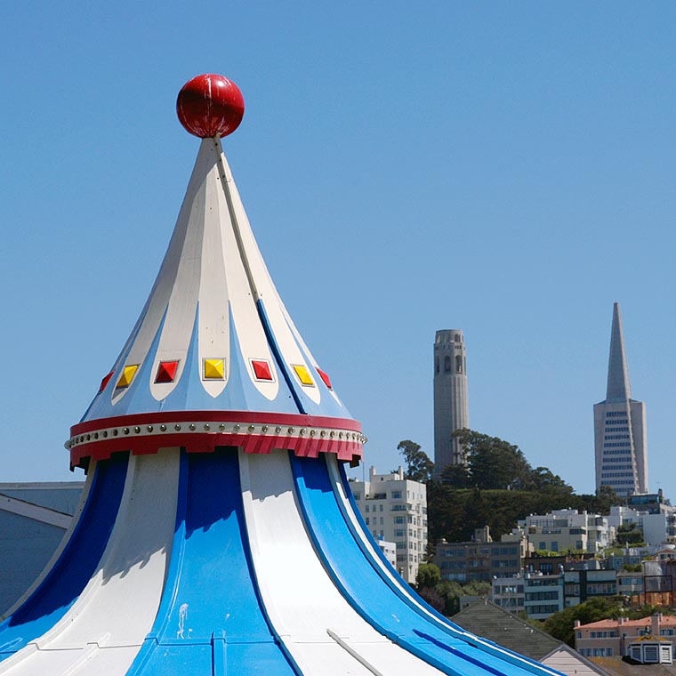
I would give it a "so-so" for the following reasons...because the carosel isn't yet a landmark, it feels too dominant in the photo. It takes over the image, while the known landmarks are dwarfed. Even though some may not be familiar with these two landmarks, they are very distinctive, and I believe they would be recognized as distinctive architechtural items immediately. The top of the carosel doesn't seem to have the interest power of the other landmarks, yet grabs for your interest by it's sheer size.
Warren T. said...
Thanks for your thoughts. The carousel WAS my main subject, so it was meant to dominate the picture. To paraphrase Steve, who quoted Bart, I meant to do that :).
I agree, I think the carousel top may not be interesting enough on its own. That's what I was wondering. The background landmarks could have been positioned in a more interesting way too. I thought that the telephoto compression effect made them pop up sufficiently in the background to be interesting.
Next time, maybe I should bring a longer telephoto to for even more compression effect and concentrate on just one of the two, probably Coit Tower. (just thinking aloud)
I'll check that out when I go down to Pier 39 again.
-- Warren
SteveR said...
I rather like it and find it an interesting perspective. Different strokes... ;-)
When I first saw it, I did get the impression "you meant to do that" in terms of making the carousel top your main subject.
You know me and how I love bold colors, so the colors of the carousel appeal to me.
Also, there's an abstraction on "tall" or "vertical structure" by the repetition of the peak of the carousel by the Coit Tower and TransAmerica Bldg.
I just read the last paragraph and I'm not sure I understand what I just said, but I'll let it stand in case it makes sense to anyone else ;-)
So I think it's good, even very good. I think your concept has the potential to be even better - if you would enjoy going back there anyway, maybe work the scene over - shifting your point of view to left, right... maybe even bring a stepladder to get some extra height.
Benson said...
I also like the picture for the bright colors. I would be interested in a different perspective slightly off to the left so the main subject, Coit tower, and the Transamerica building are closer together. I think a more dramatic change would involve a dusk or dawn shot. But it would also change the whimsical nature of the picture.
Warren T. said...
Everyone, Thanks for all your wonderful comments and ideas. It's all good information. Hey, I just thought of something. Wouldn't it be cool if the moon was positioned right on top of the TA Pyramid, like the red ball on top of the carousel? Alternatively, anything positioned in the top right part of the picture would balance it a bit.
-- Warren
posted by Warren T. at 7:23 AM
2 comments
![]()
![]()
Warren T. said...
My Questions for this shot:
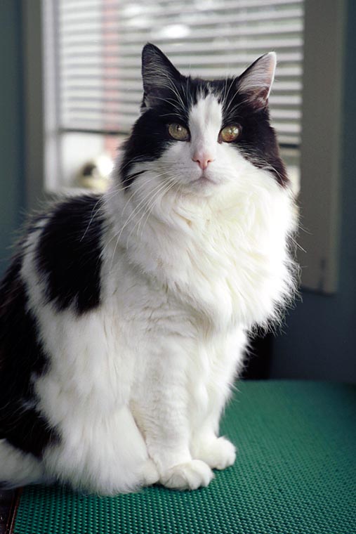
I normally don't like to center my subject like I did here, but in this case, I felt that centering was okay because of how his tail and legs were positioned. What do you think about this?
Also, I feel that the objects in the background are okay. They are not in sharp focus, and are dimmer than the main subject. They establish that Linus is at home in his environment. Do you agree with this? Or should I have blurred and/or darkened the background a little.
By the way, the on-camera flash worked well for this shot. It wasn't overpowering, and I was able to get a little backlighting on his fur.
-- Warren
Warren T. said...
I was lying on my stomach waiting for Linus to look directly at the camera for about 3 or 5 minutes. He's a calm and mellow guy so he doesn't move that quickly.
I was expecting to do some photoshop work to remove the typical flamethrower reflections from his eyes, but it didn't happen. I think there was enough ambient light in the room to keep his pupils small (luckily). Plus, D100's built in flash is small and the flash was not very strong.
-- Warren
posted by Warren T. at 11:53 PM
4 comments
![]()
![]()
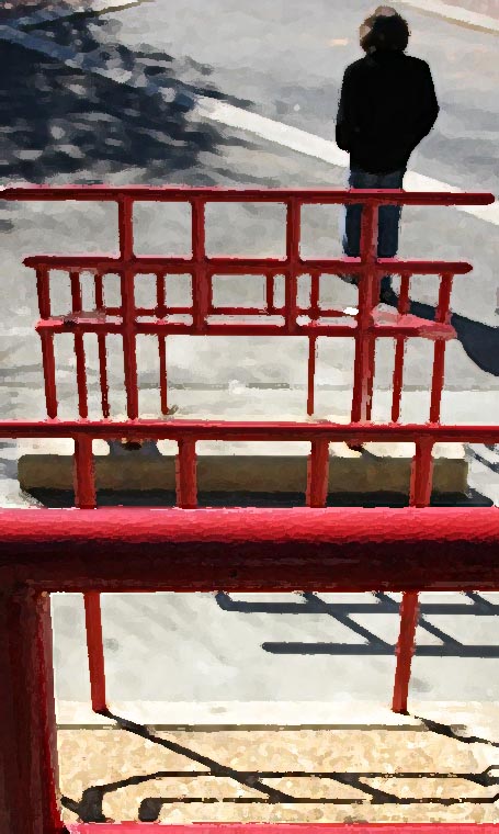
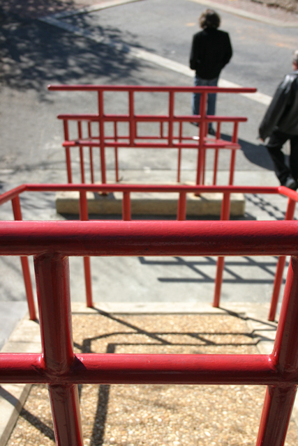
Warren T. said...
Steve, I hope this wasn't too horrifying :) I tried adding photographic grain, but I felt that it didn't do what I wanted to the background railings. I chose to use the drybrush effect, and I dialed back on the brushstroke size to make it more subtle in the final version.
-- WT
SteveR said...
Wow, really nice, Warren! It's totally different now, but more in line with what I *wanted* - more abstract. The drybrush technique is nice - not overdone at all. To my untutored eyes, the railings now look even more like Chinese characters, and even the shadows stand out more and add to the overall effect.
Thank you very much! You've inspired me to play with this image (and it's brother, shot at a smaller aperture a second or two later) this weekend.
Best regards,SteveR
SteveR said...
... and I just thought to do this. Using the "Open Link in new window" right-click menu, I opened both Warren's version and my original version in separate windows, them sized them so that I could see them side-by-side. I encourage anyone interested to try this. Warren's improvements make the image much more "finshed"-looking and "clean" - those are the 2 words that come immediately to mind.
What do you think?
-- SteveR
Warren T. said...
I must say that it was very interesting and fun to do this exercise. I tried to visualize what you were intending when you made the original picture. I'm glad that you like the result. Thanks for allowing me to edit your shot.
-- WT
posted by SteveR at 8:13 PM
2 comments
![]()
![]()
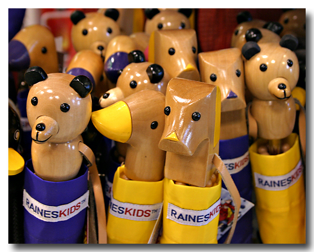
Warren T. said...
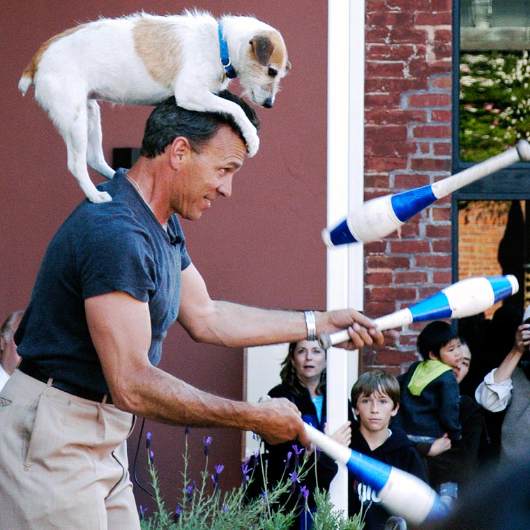
Very Cute! Here are inanimate objects that look alive. Nice grab.
A similar thing happened to me last weekend. Gail wanted to show me a store downtown that had a very interesting desing. It's actually a classically designed former bank that was converted to an Armani store. There is a restaurant in the middle of the floor and the merchandise is located around the perimeter. I was shooting my Nikon F3HP w/Tri-x that day, and it would have been interesting to shoot some of the architectural details in there. I didn't even have a chance to bring my camera to my eye when an employee of the store walked over and told us that photography is not permitted in the store. I said, "Okay, no problem, I was just admiring the building's details, why can't I take pictures?" She answered, "Store Policy".
I later saw that she was taking pictures of the display arrangements as we left the store.
If they locate themselves in a historically significant building, maybe they should be more accomodating.
-- Warren
Unknown said...
Very whimsical, this one made me smile. I like that the background ones are slightly out of focus, making the foreground group "pop."
posted by SteveR at 4:24 AM
7 comments
![]()
![]()
Warren T. said...
Steve, this was a very interesting exercise. I would be curious to know what others think of this shot.
Have you ever shown it before? There is one fundamental flaw that kills it. Your main subject of interest is not completely in focus. This looks like a quicky grab shot(which is fine). Aperture should have been set smaller, maybe f16 or smaller. You're shooting wide angle, you don't need to be at 1/1000. If you had time to think about it, maybe you could have spun the control wheel on your camera to set the aperture smaller. That being said, I think the picture can still be somewhat saved. I pulled it into Photoshop to examine it further. I would put a tighter crop on it. There is too much space around the background railing, and in the foreground, the lower space, I felt, was not needed in the shot. The tighter crop would also crop out the second person, which didn't add anything to the shot. I increased contrast by adjusting the curves, and then used a high degree of unsharp mask.
After all these things were done, I felt it was an improvement, but the soft focus in the majority of the shot was still a slight annoyance. I normally don't like to add effects to a shot, but in this case, you might want to play around with adding some grain or brushstroke effect that kind of hides the focus problem and accentuates the railiing contrast.
I also don't like to post my version of another person's picture, unless specifically requested to do so, so I'll leave it at that.
That was fun!
Thanks for posting.
-- Warren
SteveR said...
Hi Warren,
Thanks for your extensive comments!
I just took this photo over the weekend, and other than my cousin, you guys are the first to see it.
Yes, please post your version - that would really be helpful to me.
Not to sound like Bart Simpson ("I *meant* to do that !), but I was actually looking for limited depth of field and focusing on the near railing, rather than Cousin Brian and Uncle Joe at the bottom of the stairs.
Meanwhile, I have a second photo shot at a smaller aperture - I'll post that one later this week for comparison.
I'm finding this tremendously useful - it's really useful to hear what other photophiles think.
Warren T. said...
Steve, I did notice that the foreground railing was in sharp focus. The composition leads my eye from the sharp foreground railing, up the picture, to the rest of the railing. Just my opinion, but when this main subject is out of focus, it is disturbing to the eye. (at least it is to me)
Alternatively, if your foreground subject, the first railing, was composed in such a way as to be more dominant, then the eye would tend to focus more in the foreground, and be less disturbed by the out of focus area. OOF areas should probably be there to support the main subject, rather than be the main subject. So it would be okay for cousin Brian to be OOF.
...still curious to hear other opinions on this.
-- Warren
Warren T. said...
By the way, i forgot to mentin that I like the idea that the railing looks like Chinese characters. They do!
-- Warren
Dennis Fong said...
I would agree pretty much with Warren's comments, so I will not duplicate here. As far as composition, since it is somewhere you may be able to get back to, I would probably try to use the bold close railing as a frame for the other railings and human subjects. Perhaps a lower perspective through the "square" of the near railing might work?
Dennis Fong said...
This comment has been removed by a blog administrator.
Dennis Fong said...
This comment has been removed by a blog administrator.
OK, I'll try to get the ball rolling for those of us who are just voyeurs of fine photographs.
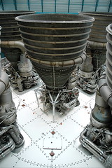
I took this at the Kennedy Space Center in Florida when we were there in October. You have to go through a video presentation before getting to see the rocket itself, which made you appreciate seeing it in person so much more. It was an impressive sight that no amateur photographer could completely capture. So I just tried getting some interesting perspectives. Taken with a Nikon D70 at 18mm on 18-70mm lens, 1/60, f3.5.
posted by Benson at 12:11 PM
4 comments
![]()
![]()
Warren T. said...
This reminds me of a scene from the sci-fi movie, like the Terminator. Or as Jill mentioned offline, the rocket motor looks like a giant industrial chemical vat. Very cool. Too bad there wasn't a person standing next to it so that we can see how huge it really is.
Thanks for posting!
--Warren
Warren T. said...
I don't want to misquote Jill.
She actually said, "looks like a high tech funnel in a chemical factory!".
I hope you don't mind that I quoted you, Jill
-- Warren
SteveR said...
I really like this image, Benson! Since I grew up during the race to the moon, this is a familiar object that brings back good memories, but you've photographed it in a way I've never seen.
I especially like the composition and the patterns. To me, there is a strong graphic feel due to the triangles or "chevron" patterns in the image: The openings of the 3 rocket nozzles form a very flattened triangle at the top of the photo. Then there are the bolting patterns on the bottom of the fuel tank - to me, they form two chevrons pointing towards the bottom of the photo, and two more pointing to the center nozzle.
Finally, there is the arc of the circular bolting pattern that ties it all together.
So to me, very nice at both the literal and graphic level!
Best regards,
SteveR
Unknown said...
Normally I am turned off by symmetry but it really works in this case. It makes exaggerates the geometry of the patterns and adds to the scientific, science fiction feel of the venue. Plus, the camera is slightly angled which keeps my brain occupied trying to straighten out the image. I like it.
posted by Warren T. at 7:56 AM
2 comments
![]()
![]()
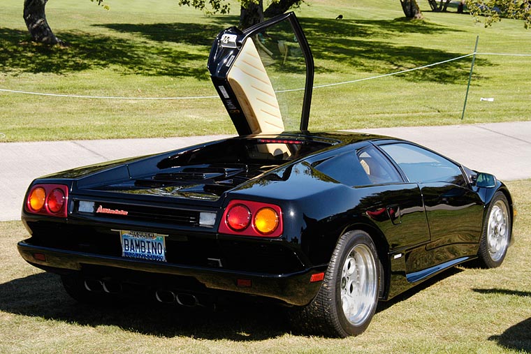
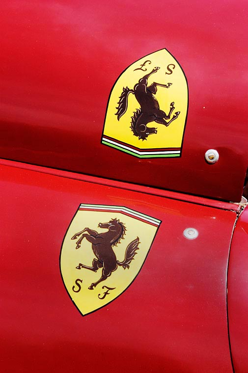
SteveR said...
Was this taken in 2002 (Year of the Horse?)
Beautiful colors and composition - very nicely isolated the logo and hood shape as design elements.
Warren T. said...
You guys are right, this WOULD have been a good shot for the year of the Horse. That was in 2002. This was taken at the Stanford Concours, in Palo Alto, California in June of 2003.
-- Warren
posted by SteveR at 4:26 AM
1 comments
![]()
![]()
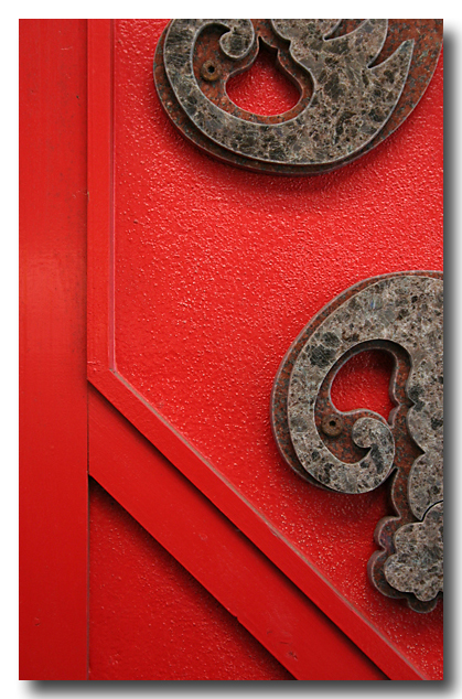
Warren T. said...
Nice shot, with just a hint of something Asian.
Since we are Cantonese, we say it this way:
Gung Hay Fat Choy!
Thanks for the New Years wishes.
-- Warren
posted by Warren T. at 7:51 AM
1 comments
![]()
![]()
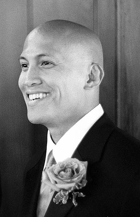
Unknown said...
Great grab - For me, the play between the incredibly full rose and that smile make the photo.
posted by SteveR at 3:08 AM
4 comments
![]()
![]()
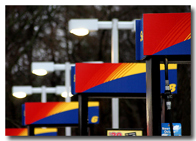
Warren T. said...
Steve,
Nice Pattern! I know what you mean about passing by a particular every day and seeing a potential picture. There is a location that I drive by every day, twice a day, that is at a local lake (Lake Merced) where I see a great shot potential. The time and season would have to be just right in order to get what I envision from it. One day, I was out testing my new 85mm prime lens, and I had to walk to that spot to do some test shots. The pictures came out okay, but it wasn't the right set of conditions to be perfect.
So, do any of you want to see that test shot? It may take years for me to get to that ideal situation. If you'd like, I can post it so that you all can get a general idea of what I saw in that location.
On to this picture. I see that you were at the limits of handhold-ability, but if you had a tripod handy, maybe you could have expanded the depth of field to include the first 3 pump stations. At first, I was thinking that the whole image should be in focus, but upon further reflection, I think that it would be okay for the lights to be a little fuzzy. My 2nd idea would be to crop out the 4th pump station and the signs from the bottom of the picture. The triple stations with the triple lights, IMO, might be a little more harmonious and even more abstract than it is now.
Maybe if you go back to that spot with your tripod, the Homeland Security people will be waiting for you :)
-- Warren
SteveR said...
Thanks for your comments, Warren - I was indeed on the ragged edge - below, actually, of where I should have been handholding the lens. It was a really dull morning, and I'm going to go back and try again on a sunnier day.
Your ideas about getting rid of the signs and the 4th pump make sense - isolating it to 3 pumps, 3 lights would make a better composition.
I may also try some Photoshopping to remove the extra elements.
Regards,
SteveR
SteveR said...
Thanks, Jill - actually, I sometimes tilt the camera to see what it brings about - your idea is excellent!
-- SteveR
Unknown said...
I also like the partial 4th pump. I think it kind of hints that the pattern could go on forever. It would worth trying again at a different angle to get rid of the signs although, they don't bother me that much. When I shoot a pattern like this, I try to put the focus on the second object instead of the first, just gives it a different look.
posted by Warren T. at 11:09 PM
0 comments
![]()
![]()
posted by SteveR at 7:03 PM
3 comments
![]()
![]()
Benson said...
This comment has been removed by a blog administrator.
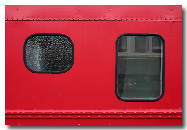
Dennis Fong said...
I see the red theme. You must have LOVED Kodachrome 25! I like how you isolate your subject matter in all of your images, leaving no doubt what the viewer should focus on.
Warren T. said...
Red is good, especially around Chinese New Year :)
I like this version better than the one on your photoblog because in this one, you expanded the view to include the second window (the one on the right). The reflection in that window tells me immediately that this is a railroad car. I like that perfect symmetry of the bolts too, and of course, the rich color.
-- Warren

This site optimized for 1024x768 or higher resolution.
4 Comments:
Wouldn't you know it, every time I go out to test some equipment, I get typical San Francisco weather, overcast and cold.
I tried to show the symmetry of the garden's design. You can see it when standing just in front of the gate. So Benson, do you like it? :)
Does anyone else beside Jill and me still shoot film? I was looking for a replacement for Royal Gold 200 which is discontinued, so I decided to try a few rolls of Kodak Ultracolor 100 professional. I have not shot ISO 100 negative film for a long time, and I must say that this UC100 is very impressive. It has some very good attributes: very fine and sharp grain, great shadow detail, excellent color saturation, and ease of scanning (not much correction needed). I also ordered some Fuji Realea for comparison.
-- Warren
Is the flare towards the top of the photo? You should not be getting flare on an overcast day. Maybe you have a filter on the lens? Try doing a test without a filter. I borrowed a friend's 40mm Distagon for the Hasselblad and found it had a flare problem. I couldn't deal with it.
The flare was in the same spot in every picture where it appeared. After I finished the roll, I noticed a smudge on the front lens element. Maybe that was what caused it? I was shooting bare lens because I didn't have time to buy a filter for it yet.
I hope the smudge was the problem. If not, that's a pretty serious flare problem.
-- WT
And to answer the qustion, yes, it was in the upper right side of the photo (see previous picture post).
-- WT
Post a Comment