White Crane at Stow Lake
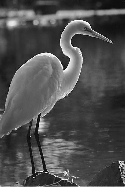
Made with 200mm Nikon lens on Ilford film. The crane is not shy, I shot this from about twelve feet.
posted by martin at 4:02 PM
2 comments
![]()
![]()
We are a small group of friends with a common love of photography. We hope to enjoy each others' work and to broaden our knowledge of photography and to stimulate our creativity by sharing our work and ideas here. Please invite your friends to stop by. If you are interested in becoming a photo contributor, please send me an email. --Warren
posted by martin at 4:02 PM
2 comments
![]()
![]()


posted by Warren T. at 6:35 AM
2 comments
![]()
![]()
 martin said...
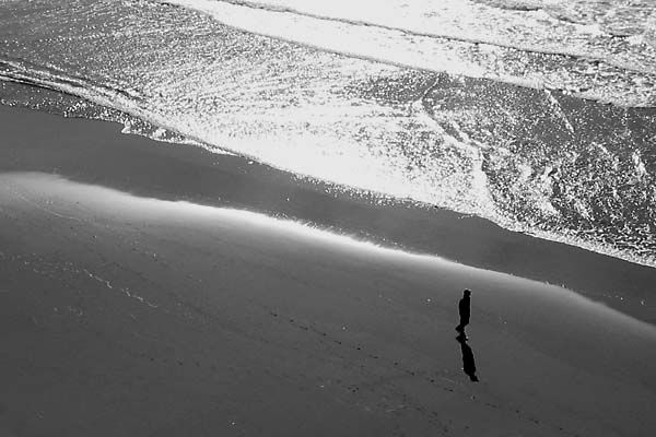
I can't make up my mind on this one. Here's what I like: The reflection of the boy is nice, I like the dark tones and the highlights reflecting in the water. The texture of the waves is nice too.
As to the negatives: I see a horizontal pattern created by the waves and the horizon. I would rather see diagonal lines which would give me more of a sense of depth. Also the darkness of the photo is kind of surreal. What does it look like in color? Maybe giving the photo an orange tint would make to look more pleasing.
Warren T. said...
I was trying for a surreal "look". Thanks for validating that for me :).
Since the camera was aimed almost directly at the light, the resulting shot was very monochromatic. I decided to take it all the way and convert it to B&W since there was not much color to speak of anyway.
Interesting comment about diagonal wave lines. I'll have to take my camera out to the beach to do some experimentation. The spontaneous situation with the boy in just the right position precluded me from taking too much time.
--Warren

posted by Warren T. at 10:46 PM
1 comments
![]()
![]()
martin said...
Yes, it's better. The photo is composed of shapes, textures, and gray tones. The problem is the car didn't have color. The green reflection included information about the enviroment in which it was taken. Maybe it's relevant and maybe not. In this case probably not.
posted by martin at 2:51 PM
3 comments
![]()
![]()
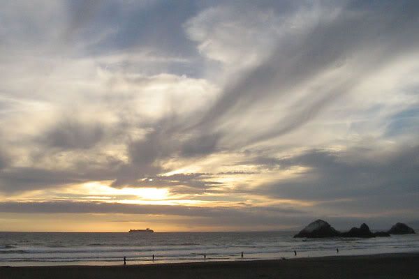
Warren T. said...
Am I going crazy? I could have sworn that this picture was B&W. Nice shot, by the way. --Warren
martin said...
Yeah. I reposted a color version. I can't decide if I like is in color or black and white.
Warren T. said...
Is it the exact same shot? The B&W one accentuates the clouds, while the color one puts a little more emphasis on the ship passing by. I prefer the B&W one.
posted by martin at 10:09 AM
3 comments
![]()
![]()
Dolph Brust said...
The more I look at this picture the more I see. The footprints in the sand, the movement of the water, the shadow of the man. The contrast of the smooth sand to waves in the water is very nice.
The use of Black and White is very nice. Only question, did you take the picture when the sun was not as direct?
Great shot!
martin said...
If the light was different, the picture would not have the same look. I shot the photo at about 4 o'clock in the afternoon. It probably would have been better if I had waited a little later as the shadow of the person would have been longer and the footprints more noticable. I'm a bit disappointed in this shot actually as I shot this on digital and the highlights are blown out with no detail. The digital camera just doesn't have the dynamic range to handle a contrasty lighting scene. Also the camera I'm using doesn't have manual settings for the exposure so I'm at the mercy of the auto setting.
Warren T. said...
I was going to say something about that blown highlight smack dab in the middle of the picture, but you beat me to it. It's kind of obtrusive to the overall mood of the shot. That's why most prosumer level and above digital cameras are tuned to underexpose a bit (to avoid blown highlights).
The composition is very nice. I like the repetition of the diagonal lines beginning with the waves on the upper right, then the wet sand line, then the footprints. They draw the eye to the man walking with his shadow.
I like beach shots. Anyone else have one to post? I have one that I might post soon.
--Warren

This pic was taken in 2001 when we visited St. Louis. I was so fascinated by the Arch that I took quite a few pictures of it. This was taken with my old Sony DSC-D70. I took this picture to show how the Arch has a welding seam. It is actually made of steel. I always thought it was concrete. Anyway, the day was overcast which made for a very interesting background. I have a few more pics of the Arch if anyone is interested.
posted by Benson at 9:54 PM
6 comments
![]()
![]()
martin said...
Nice composition, a bit abstract but that's OK. There's no sense of scale but that's OK too. I like the way the frame is filled and sweeping curves of the arch. The seam in the center works. Looks a little flat on my monitor but that's an easy fix with Photoshop.
martin said...
This comment has been removed by a blog administrator.
Warren T. said...
Beautiful Composition! Your picture perfectly illustrates the dramatic sweep of the arch. You're right, the clouds enhance the shot. This has the potential to be an outstanding picture. It just needs a little post-processing work to correct the levels and contrast. I'm interested in seeing your other shots, either posted here or you can point me to them elsewhere. --Warren
Dolph Brust said...
Nice Work. I like the two contrasts in the picture. First I notices the smooth surface of the arch compared to the overhead clouds. Next, I like the contract between the direction of the arch to the direction of the clouds.
Dolph Brust said...
This comment has been removed by a blog administrator.
Dolph Brust said...
This comment has been removed by a blog administrator.

posted by Dolph Brust at 6:56 PM
3 comments
![]()
![]()
Warren T. said...
The subject is interesting, well centered, and decently exposed. There is room for improvement. You may have been limited in your ability to walk around the bird because of the surroundings. Part of the wing is blocked by the tree. I'm not sure if you intended for the people to be in the picture, but if you shot from a lower angle, you could have moved the distractions out of the frame. Of course, that may introduce other distractions. You just have to play with it a bit to get the right position. From the current position, the area behind the neck and head look good, so perhaps a close-up of the head and neck detail might work from this angle.
Just some thoughts. That's an interesting looking bird.
Thanks for posting.
--Warren
martin said...
Nice color but other of the things in the photo detract from the main subject. Perhaps shooting at a wider aperture or using a longer lens would help. Maybe getting closer and photographing the detail of the bird?
Benson said...
I agree with the above posts. I think the bird itself is very interesting and I like the background with the trees. However, the people in the background are distracting. I was thinking the same thing as Warren in that perhaps it would have been nice to get a different perspective to try to change the background. It can be difficult because of limitations of where you can walk and the time allowed for the shot. I know with an 18-month old, you can't always spend 10-15 minutes composing a shot. You just have to take it as it comes. Maybe playing with it in Photoshop?
Warren T. said...
This looks like a very well done composite of two pictures with one inverted to make it look like a reflection. Did you use a tripod? Good work, and thanks for posting. --Warren
martin said...
I don't agree with Warren on this one. That tree is in the center of the frame which is usually not a good way to compose a photo. Try to divide the frame in thirds and place a compositional element one third or two thirds from the edge of the frame.
Depending on the camera you are using you may have a problem focusing and composing your photos. I know I did when I had my Canon EOS 1 which only had a single focus sensor at the center of the frame. I would focus putting my subject in the center of the frame and then recompose the photo. If I wanted to check the focus I would shift the subject to the center again. This was common if you had a Nikon or Nikkormat with a split image rangefinder in the old days too.
Other than that I think the photo is missing something else. It's not visually interesting, not enough form, graphic elements or color.
Warren T. said...
Agreed to disagree (w/Martin) :).
Sometimes symmetry works, and in this case, it works for me.
I still want to hear how Dolph created this pictures.
--Warren
Benson said...
To me, the picture looks like it is turned upside down. It looks like the reflection off the water (which is very, very still) is in the upper half of the picture. I turned the picture around and it looked more "normal" relative to how we perceive things. As an untrained photographer, I like the picture for its symmetry.
Dolph Brust said...
Benson is correct. It is upside down. What made the picture interesting to me is that some of the objects disappeared in the reflection.
Warren, This was taken off my back patio early one morning with a point and shoot.
Martin, You give me so much to think about. Keep the comments coming! I want to go and shoot, but it is dark outside. Thank for the info.
martin said...
I was looking at the photo again and wondered why the sky on the top half was darker than the sky at the bottom. An upside down photo explains it. Actually the late afternoon or early evening light would make a nice photo. Or was this in the early morning?
Warren T. said...
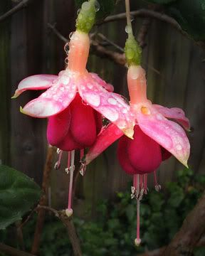
This is a stunning shot! The colors are beautiful, and the position of the flowers is perfect. The background is pleasantly blurred and dark. Did you do much photoshop work on this picture? --Warren
martin said...
Yes, there is a bit of burning in of the background and highlights. I tried to make this shot on film years ago and was not successful. With Photoshop and a digital camera it's much easier. Couldn't burn with precise control in color in the old days with a conventional darkroom. Also my Photoshop skills a bit better than they were two years ago.

posted by Unknown at 7:13 PM
2 comments
![]()
![]()
martin said...
Nice shapes, use of negative space. I would crop the top part of the photo out. Light areas attract the viewer. Nice opening shot maybe. Why are you doing this story in color? It may be too challenging for beginners and black and white done well can convey mood a bit better.
Warren T. said...
I like the way the tree limb on the left mimics the angle of the man's head. On the other hand, the man is doing something that does not appear related to the approaching bus, kind of a mixed message. I understand the framing of the bus by the tree and the object on the right. It's a good idea. However, the object on the right is simply a black straight line with no detail. To me, it doesn't have enough distinction. It looks simply like the picture was masked on the right, or like a shutter malfunction. Perhaps a tighter crop would help, and the tighter crop might also bring more attention to the 48 bus.
--Warren

posted by Unknown at 7:03 PM
4 comments
![]()
![]()
martin said...
If you try to do "stealth" street photography I would try to use a point and shoot digital, it fits in your hand and doesn't look like you're a photographer. Interesting light in this photo, but not enough context. Maybe try shooting photos of people interacting on the bus or not interacting. There were a few photo projects done in the 50s and 60s of people on the New York subways. Try to look on the internet.
martin said...
The photographers that shot the subway photos were Walker Evans and Bruce Davidson.
Warren T. said...
This picture works for me. I know that this was a grab shot, but I feel that the camera angle, subject offset, and "J" shaped shadow that extends from the right side to the bottom of the shot really fit the quirky subject. The bright swatch of yellow colored shirt and sky blue in the window helps contrast the rough appearance of the subject. The pictures stands alone, but in the context of a documentary, it may help if the angle of view was wider to show more of the bus.
It's hard to shoot street shots with a SLR. Nice grab.
--Warren
Warren T. said...
This comment has been removed by a blog administrator.

posted by Unknown at 6:53 PM
2 comments
![]()
![]()
martin said...
A bit dark and flat. Subject is looking at the camera which sometimes can work. Maybe the photo can work in black and white??
Warren T. said...
Interesting shot. The angle of the picture gives the impression of a surveillance camera. I like the way the subjects white cap can be seen in the mirror. The two people in the background are nicely positioned relative to the main subject, and give some counterpoint. In this case, the subject looking directly at the camera may distract a bit from the feeling of the shot, depending on what mood you're trying to achieve.
Thanks for posting!
--Warren
martin said...
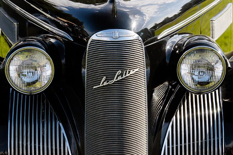
Not a bad shot. Old cars with chrome are neat! They just don't make them like that anymore. Nice lines and shapes. Only suggestion I would make is that the green reflection from the grass doesn't add anything. Maybe better as black and white.
Unknown said...
I like the idea of converting it too black and white. Can you repost so we could see the difference?
Warren T. said...
Guys, thanks for the comments. Maybe it's because I took the picture, but my mind seems to have involuntarily blocked out the green reflection. I didn't pay attention to it until Martin pointed it out. Very interesting. If I have time, I'll convert the shot to B&W to see how it looks. --Warren

posted by Warren T. at 11:50 PM
0 comments
![]()
![]()

posted by Warren T. at 11:12 PM
0 comments
![]()
![]()

posted by Warren T. at 7:45 AM
1 comments
![]()
![]()
 said...
The photo with St. Patrick's Church right next to the "Jukebox" building (I forget its name now) was wonderfully captured. I like the juxtaposition of the huge/modern and the small/graceful. I also like the warm pinkish hue against the buildings. I've seen them in person several times and have always been fascinated at how the Church has managed to survive this long.
--Joao

posted by Warren T. at 7:29 AM
2 comments
![]()
![]()
Unknown said...
Warren - the pictures is great. The different positions of the plane give me an idea what the stunt must have been like. I like the way the planes on the left balance the planes on the right. The smoke in the background adds an additonal visual element for my eye to explore
martin said...
A nice photo! I like it because it's different. Most of us have shot Fleet Week before and we get photos of the planes flying in formation which is pretty typical. You used a long telephoto lens which compresses the planes and looks like they are in an aerial dogfight.

posted by Warren T. at 1:33 AM
1 comments
![]()
![]()

This site optimized for 1024x768 or higher resolution.

2 Comments:
I like the feather detail on the top of the head and on the body, and the pin-sharp focus on the head and neck. The great rim lighting really highlights the lovely S-shape of the bird's neck. Just one minor, minor nit...the bird's tail is ever so slightly out of the frame (it doesn't detract very much from the rest of the picture though). This is a really gorgeous shot. Thanks for posting.
This is a wonder shot. What did you pay the bird...6 fish? The tail is the only thing. The backlighting is great, the details, eveything! Ok, now I don't want to post anymore pics.
Post a Comment