Saturday, October 23, 2004
Contributors
Links
- FPCF Home Page
- Rangefinder Forum
- Micro 4/3 Forum
- Serious Compacts Forum
- ViewfinderSF.com(Warren's web gallery site)
- Viewfinder-SF(Warren's SF Only Photoblog)
- Steve Rosenbach Photography
- Lea's Flickr Photostream (Lea)
- heart, soul, & a camera(Back Alley's Photoblog)
- Sweetfstop (Dan's new photo site)
- Lena's Aminus3 Photoblog
- Sweetfstop (Dan's new photo site)
Previous Posts
- Origninally, I tried just shooting - didn't work. ...
- I am working on a documentary project for a class ...
- Car - Face, Nikon D100, Tamron 24-135mm @ 65mm, 1/...
- Confessional - The church was dark except for the ...
- Peppers -- I shot this at the 2001 Sonoma Harvest ...
- Architectural contrast: Old St. Patrick's Church n...
- Canadian Snowbirds performing a stunt. Nikon D100,...
- Llama Portrait
- Mission Santa Barbara, Sony DSC-D770 (1.5MP)
- Pier 39 on July 4, 2003. Nikon D100, Tamron 24-135...
Archives
- September 2004
- October 2004
- November 2004
- December 2004
- January 2005
- February 2005
- March 2005
- April 2005
- May 2005
- June 2005
- July 2005
- August 2005
- September 2005
- October 2005
- November 2005
- December 2005
- January 2006
- February 2006
- March 2006
- April 2006
- May 2006
- June 2006
- July 2006
- August 2006
- September 2006
- October 2006
- November 2006
- December 2006
- January 2007
- February 2007
- March 2007
- April 2007
- May 2007
- June 2007
- July 2007
- August 2007
- September 2007
- October 2007
- November 2007
- December 2007
- January 2008
- February 2008
- March 2008
- April 2008
- May 2008
- June 2008
- July 2008
- August 2008
- September 2008
- October 2008
- November 2008
- December 2008
- January 2009
- February 2009
- March 2009
- April 2009
- May 2009
- June 2009
- July 2009
- August 2009
- September 2009
- October 2009
- November 2009
- December 2009
- January 2010
- February 2010
- March 2010
- April 2010
- May 2010
- June 2010
- July 2010
- August 2010
- September 2010
- October 2010
- November 2010
- December 2010
- January 2011
- February 2011
- March 2011
- April 2011
- May 2011
- June 2011
- July 2011
- August 2011
- September 2011
- October 2011
- November 2011
- December 2011
- January 2012
- February 2012
- March 2012
- April 2012
- May 2012
- June 2012
- July 2012
- August 2012
- September 2012
- October 2012
- November 2012
- December 2012
- January 2013
- February 2013
- March 2013
- April 2013
- May 2013
- June 2013
- July 2013
- August 2013
- September 2013
- October 2013
- November 2013
- December 2013
- January 2014
- February 2014
- March 2014
- April 2014
- May 2014
- June 2014
- July 2014
- August 2014
- September 2014
- October 2014
- November 2014
- December 2014
- January 2015
- February 2015
- June 2015
- August 2015
- September 2015
- October 2015
- December 2015


2 Comments:
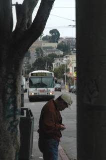
Nice shapes, use of negative space. I would crop the top part of the photo out. Light areas attract the viewer. Nice opening shot maybe. Why are you doing this story in color? It may be too challenging for beginners and black and white done well can convey mood a bit better.
I like the way the tree limb on the left mimics the angle of the man's head. On the other hand, the man is doing something that does not appear related to the approaching bus, kind of a mixed message. I understand the framing of the bus by the tree and the object on the right. It's a good idea. However, the object on the right is simply a black straight line with no detail. To me, it doesn't have enough distinction. It looks simply like the picture was masked on the right, or like a shutter malfunction. Perhaps a tighter crop would help, and the tighter crop might also bring more attention to the 48 bus.
--Warren
Post a Comment