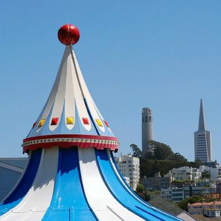
Landmarks, San Francisco, Nikon D100, Tamron 24-135mm @ 75mm, 1/500 f11.

This is another from my series shot on July 4th, 2003. I was at Pier 39 standing on a 2nd level walkway. I was looking down on a sea of humanity below. Then my eyes wandered up to see the top of the carousel with the familiar SF landmarks (Coit Tower & Transamerica Pyramid) behind it. I thought the carousel itself may become a landmark in SF, we'll Pier 39 certainly is.
Is this an interesting view, or ...just so-so?
-- Warren

5 Comments:
I would give it a "so-so" for the following reasons...because the carosel isn't yet a landmark, it feels too dominant in the photo. It takes over the image, while the known landmarks are dwarfed. Even though some may not be familiar with these two landmarks, they are very distinctive, and I believe they would be recognized as distinctive architechtural items immediately. The top of the carosel doesn't seem to have the interest power of the other landmarks, yet grabs for your interest by it's sheer size.
Thanks for your thoughts. The carousel WAS my main subject, so it was meant to dominate the picture. To paraphrase Steve, who quoted Bart, I meant to do that :).
I agree, I think the carousel top may not be interesting enough on its own. That's what I was wondering. The background landmarks could have been positioned in a more interesting way too. I thought that the telephoto compression effect made them pop up sufficiently in the background to be interesting.
Next time, maybe I should bring a longer telephoto to for even more compression effect and concentrate on just one of the two, probably Coit Tower. (just thinking aloud)
I'll check that out when I go down to Pier 39 again.
-- Warren
I rather like it and find it an interesting perspective. Different strokes... ;-)
When I first saw it, I did get the impression "you meant to do that" in terms of making the carousel top your main subject.
You know me and how I love bold colors, so the colors of the carousel appeal to me.
Also, there's an abstraction on "tall" or "vertical structure" by the repetition of the peak of the carousel by the Coit Tower and TransAmerica Bldg.
I just read the last paragraph and I'm not sure I understand what I just said, but I'll let it stand in case it makes sense to anyone else ;-)
So I think it's good, even very good. I think your concept has the potential to be even better - if you would enjoy going back there anyway, maybe work the scene over - shifting your point of view to left, right... maybe even bring a stepladder to get some extra height.
I also like the picture for the bright colors. I would be interested in a different perspective slightly off to the left so the main subject, Coit tower, and the Transamerica building are closer together. I think a more dramatic change would involve a dusk or dawn shot. But it would also change the whimsical nature of the picture.
Everyone, Thanks for all your wonderful comments and ideas. It's all good information. Hey, I just thought of something. Wouldn't it be cool if the moon was positioned right on top of the TA Pyramid, like the red ball on top of the carousel? Alternatively, anything positioned in the top right part of the picture would balance it a bit.
-- Warren
Post a Comment