Can This Photo Be Saved?...
Untitled

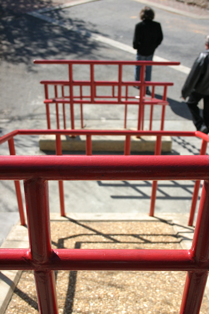
Canon Digital Rebel, EF-S 18-55mm
1/1000 @ f/6.3
I keep looking at this photo and thinking that their might be something to it... but I just don't know.
I like the red (of course!) and the perspective and the way the fellow at the bottom (my Cousin Brian) is standing. I must have Chinese New Year on the brain, because the railings suggest Chinese characters.
But I'm just not sure about this one. I can't even come up with a title.
What do you think? Does it do anything for you? (I won't be insulted if the answer is no ;-) Can you suggest any cropping or other manipulation to make it better?
... Or should this one be relegated for the virtual dustbin?
posted by SteveR at 4:24 AM
7 comments
![]()
![]()

7 Comments:
Steve, this was a very interesting exercise. I would be curious to know what others think of this shot.
Have you ever shown it before? There is one fundamental flaw that kills it. Your main subject of interest is not completely in focus. This looks like a quicky grab shot(which is fine). Aperture should have been set smaller, maybe f16 or smaller. You're shooting wide angle, you don't need to be at 1/1000. If you had time to think about it, maybe you could have spun the control wheel on your camera to set the aperture smaller. That being said, I think the picture can still be somewhat saved. I pulled it into Photoshop to examine it further. I would put a tighter crop on it. There is too much space around the background railing, and in the foreground, the lower space, I felt, was not needed in the shot. The tighter crop would also crop out the second person, which didn't add anything to the shot. I increased contrast by adjusting the curves, and then used a high degree of unsharp mask.
After all these things were done, I felt it was an improvement, but the soft focus in the majority of the shot was still a slight annoyance. I normally don't like to add effects to a shot, but in this case, you might want to play around with adding some grain or brushstroke effect that kind of hides the focus problem and accentuates the railiing contrast.
I also don't like to post my version of another person's picture, unless specifically requested to do so, so I'll leave it at that.
That was fun!
Thanks for posting.
-- Warren
Hi Warren,
Thanks for your extensive comments!
I just took this photo over the weekend, and other than my cousin, you guys are the first to see it.
Yes, please post your version - that would really be helpful to me.
Not to sound like Bart Simpson ("I *meant* to do that !), but I was actually looking for limited depth of field and focusing on the near railing, rather than Cousin Brian and Uncle Joe at the bottom of the stairs.
Meanwhile, I have a second photo shot at a smaller aperture - I'll post that one later this week for comparison.
I'm finding this tremendously useful - it's really useful to hear what other photophiles think.
Steve, I did notice that the foreground railing was in sharp focus. The composition leads my eye from the sharp foreground railing, up the picture, to the rest of the railing. Just my opinion, but when this main subject is out of focus, it is disturbing to the eye. (at least it is to me)
Alternatively, if your foreground subject, the first railing, was composed in such a way as to be more dominant, then the eye would tend to focus more in the foreground, and be less disturbed by the out of focus area. OOF areas should probably be there to support the main subject, rather than be the main subject. So it would be okay for cousin Brian to be OOF.
...still curious to hear other opinions on this.
-- Warren
By the way, i forgot to mentin that I like the idea that the railing looks like Chinese characters. They do!
-- Warren
I would agree pretty much with Warren's comments, so I will not duplicate here. As far as composition, since it is somewhere you may be able to get back to, I would probably try to use the bold close railing as a frame for the other railings and human subjects. Perhaps a lower perspective through the "square" of the near railing might work?
This comment has been removed by a blog administrator.
This comment has been removed by a blog administrator.
Post a Comment