Saturday, March 25, 2006
Contributors
Links
- FPCF Home Page
- Rangefinder Forum
- Micro 4/3 Forum
- Serious Compacts Forum
- ViewfinderSF.com(Warren's web gallery site)
- Viewfinder-SF(Warren's SF Only Photoblog)
- Steve Rosenbach Photography
- Lea's Flickr Photostream (Lea)
- heart, soul, & a camera(Back Alley's Photoblog)
- Sweetfstop (Dan's new photo site)
- Lena's Aminus3 Photoblog
- Sweetfstop (Dan's new photo site)
Previous Posts
- Victorian Reflection
- Mar. Project -- Japantown Peace Plaza
- Better B&W From Digital
- Fenced
- Bridgewalker
- Recent Additions to my RF Collection
- Dining Out in Palo Alto
- Homeless Clothing
- Gotcha!
- Wushu Form
Archives
- September 2004
- October 2004
- November 2004
- December 2004
- January 2005
- February 2005
- March 2005
- April 2005
- May 2005
- June 2005
- July 2005
- August 2005
- September 2005
- October 2005
- November 2005
- December 2005
- January 2006
- February 2006
- March 2006
- April 2006
- May 2006
- June 2006
- July 2006
- August 2006
- September 2006
- October 2006
- November 2006
- December 2006
- January 2007
- February 2007
- March 2007
- April 2007
- May 2007
- June 2007
- July 2007
- August 2007
- September 2007
- October 2007
- November 2007
- December 2007
- January 2008
- February 2008
- March 2008
- April 2008
- May 2008
- June 2008
- July 2008
- August 2008
- September 2008
- October 2008
- November 2008
- December 2008
- January 2009
- February 2009
- March 2009
- April 2009
- May 2009
- June 2009
- July 2009
- August 2009
- September 2009
- October 2009
- November 2009
- December 2009
- January 2010
- February 2010
- March 2010
- April 2010
- May 2010
- June 2010
- July 2010
- August 2010
- September 2010
- October 2010
- November 2010
- December 2010
- January 2011
- February 2011
- March 2011
- April 2011
- May 2011
- June 2011
- July 2011
- August 2011
- September 2011
- October 2011
- November 2011
- December 2011
- January 2012
- February 2012
- March 2012
- April 2012
- May 2012
- June 2012
- July 2012
- August 2012
- September 2012
- October 2012
- November 2012
- December 2012
- January 2013
- February 2013
- March 2013
- April 2013
- May 2013
- June 2013
- July 2013
- August 2013
- September 2013
- October 2013
- November 2013
- December 2013
- January 2014
- February 2014
- March 2014
- April 2014
- May 2014
- June 2014
- July 2014
- August 2014
- September 2014
- October 2014
- November 2014
- December 2014
- January 2015
- February 2015
- June 2015
- August 2015
- September 2015
- October 2015
- December 2015


4 Comments:
A very, very good series, Warren - I like this one (#2) the best, but I like them all.
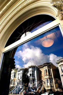
You really managed to get excellent exposure for both the reflection and the surrounding "frame",especially on #2 and #3.
I think I like #2 best because the "frame" is more secondary than in #1 and #3 ... and because there are only so may ways to include the arch - you had to either cut off a piece in #3 (arcus interruptus) or leave in stuff outside the arc as in #1. In both of these cases, the arc is, in my mind, either the primary element or at least a co-equal element with the reflection.
But in #2, the reflection is definitely the main element, and "suggesting" the arc in the upper left corner as you did works very, very well for me - the Gestalt that you taught us about does its job and fills in the "arc-i-ness" of it without any distraction whatsoever from the "frame" - the "frame" in this case is totally complementary to the main subject.
How's THAT for an artsy-fartsy analysis??? :-)
-- SteveR
I'll have to chime in and agree with Steve. For me, I liked the composition of this photo. I liked how the light fixture appears to be an element in the sky like the sun or moon. Very nicely exposed as well.
Steve,
I just found out that this old church has quite a history. It was originally a synagogue from the 1890's, serving the 20,000 Jews who settled in this neighborhood before it became Japantown. I uncovered more infomation about it, and I posted it on my personal blog. Be sure to follow the link to the museum exhibit...
http://warren128.blogspot.com/2006/04/victorian-reflection.html
--Warren
Warren,
I really like this shot a lot. The composition came out great in what looks like a very difficult to compose shot. Both the upward lean and the direction of the clouds add nicely to the composition. Very well done!
Steve F
Post a Comment