Bowling Alley Abstract
 I've always liked the "graphic" painted on the front of this otherwise semi-shabby bowling alley near my Mom's, and I've been wanting to try some "abstract" photos of it for a while. An overall picture of the scene is at top - not a beautiful sight as you can see. I'm not sure my "abstract" succeeds - what do you guys think?
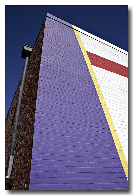 Taken withe Canon Digital Rebel and "kit" 18-55mm zoom lens. I gave it some "under" exposure compensation so as not to burn out the white-painted bricks in the bright sunlight. The sky was already a deep blue, but the exposure shift deepened it some more.
posted by SteveR at 5:55 AM
6 comments
![]()
![]()

6 Comments:
Very interesting composition...and very abstract. I kind of wonder what will it be if the blue line goes touching the very corner on the bottom right and the longest line goes all the way to the top...thereby giving it quite a pack of triangles and....well
PAT
Steve,
I think it was a success! It's great as it is, but I agree with Pat regarding the slight tweaking of the cropping/composition. It might add a little something "extra" to the abstraction.
The white bricks were not burned out, but on the other hand, I think the other colors could benefit from some lightening. By doing so, you might bring out and emphasize the geometry a little more (it seems a bit dark to my eyes), and give the overall image a little more "pop".
I really like the combination of colors, and it even has the trademark SteveR splash of red :).
The geometry of this one reminds me of my building abstract from July 2005:
http://fpcf.blogspot.com/2005/07/building-abstract-2-downtown-sf-nikon.html
--Warren
Thanks Pat & Warren!
I'm not sure I understand Pat's cropping advice - can you try describing it again? ;-)
Also, I should be able to lighten up the middle tones using the Levels dialog in Photoshop - you're right- it does appear too dark.
-- SteveR
>>The geometry of this one reminds me of my building abstract from July 2005:<<
ah - not THAT was a masterpiece - I'm flattered that you would consider this one in the same ballpark - I this one, but I think your July 2005 abstract is "more better." ;-)
-- SteveR
Steve,
I'll email my version to you so that you'll see what we mean...
--WT
Hi Steve, sorry for the belated reply. What I meant was to move the ceiling of the photo a little downward and touching the tip of the walls. Also, move the photo slightly to the right so that the white triangle is seen pointing more fully to the bottom right hand corner.The results--more triangles for...
PAT
Post a Comment