Posted for Eric! -- #2
Camera: Sony DSC-H1
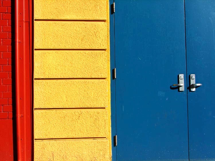
The color photo was just something I saw while walking on Van Ness. I noticed how nice the colors were and wanted to see how it would look. The ISO was set at 64 and I took at a shutter speed of 250 and w/an f stop of 8.0.
--EJ
[brightness and contrast edited by WT]
posted by Warren T. at 7:55 AM
9 comments
![]()
![]()

9 Comments:
Hi Eric,
Thanks for jumping right into the forum with both feet!
On this shot, I like the way the lines of the building alternate between vertical and horizontal, and the way the colored bands increase in width across the picture. Nice colors too, but they may need some levels adjustment. I only adjusted the picture size for you, I didn't touch anything else in the photo.
--Warren
The colors are interesting but this photo is a bit static for me. There is only one plane of focus with no depth. The horizontal and vertical lines don't help either. You need some diagonal lines. Take a look at Steve's photo from last week of the flag painted on wood. He choose to shoot it at an angle rather than head on. Try photographing it again. The opportunity will still be there.
It's always interesting to me how there can be different interpretations on any given shot.
It must be the analytical side of me that causes me to often like images that have precisely aligned, straight lines, despite the popular rule of thumb that diagonals are more dynamic.
It would be interesting to see a comparison shot with some diagonal lines instead, like Martin suggested.
--Warren
I was disappointed on how the colors came out because they looked much brighter on the Sony's LCD and when I looked at it on my computer screen. Oh well, I guess some things just don't translate well.
Eric, the view on the on-camera lcd is usually not a good way to judge the actual color of the shot (or any other shot parameters, for that matter except maybe composition). And more often than not, images need to be adjusted a little in post-processing. If you don't mind, i'll go ahead and bump up the color levels a bit later tonight and repost that picture.
--WT
Sounds good. Please bump up the color levels.
I just used the MS Office photo editor to change brightness and contrast levels. How does it look now? Better? Still need some more? Let me know.
--WT
The colors are much better. Much more vibrant and clean.
Wow, that looks a lot better Warren. Thx. When originally looking at the photo, it was the colors that drew my eye and what I thought made the picture. I will be remembering this about how color can change on screen. Like I said, it looked ok on both the LCD on the camera and on the computer screen.
Much appreciated.
Post a Comment