250 W Pratt - Abstract
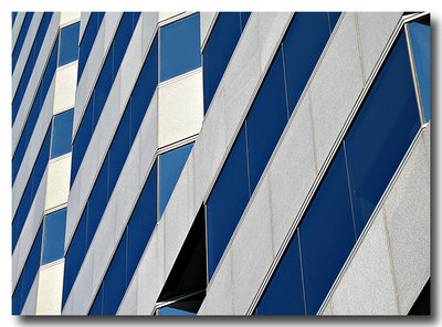
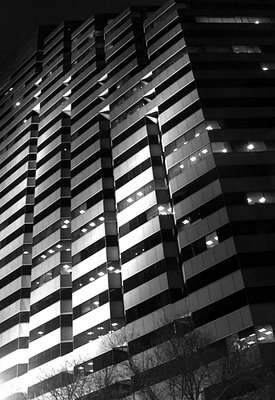
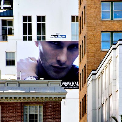
This 1986-vintage, 24-floor building was designed by Skidmore, Owings & Merrill. It's 360 feet tall (110 m), and its half-ziggurat profile and handsome banding make it a real standout any city would be proud the call its own.
We are a small group of friends with a common love of photography. We hope to enjoy each others' work and to broaden our knowledge of photography and to stimulate our creativity by sharing our work and ideas here. Please invite your friends to stop by. If you are interested in becoming a photo contributor, please send me an email. --Warren
Great composition, Martin! It's a lovely combination of sky, clouds, water, reflections, sand, and patterns.
--WT
Nice pic :)
Wow, it's really intriguing! The reflection of the sky looks almost murky, despite the pretty blue colour. It must be the crazy designs in the wet sand!
Great photo!
Wonderful feeling of peace. When I fish, it is often to relax and get the peace of mind you only get next to water.
This picture also has wonderful elements combined together. Thanks for sharing Martin.
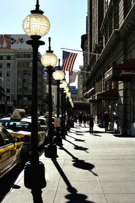
An interesting assortment of shades and shadows. Very cool :)
Very nice, Steve!
You should have stuck your face in the bottom of the frame (for some human interest :P)
--Warren
Nice photo, Steve. I like the angle of the photo, the interesting building itself, and you have all shades from white whites to black blacks.
Eric
Sorry to be silent for so long. Nice shot, I like the different shades of grays and whites.
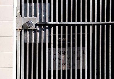
Great photo! I had a laugh. Talk about making a confusing statement. I think the City did it on purpose to confuse the poor residents and tourists!
Eric
I wonder how much higher they're going to go! Ha Ha. Fun shot.
Curtis
Thanks guys.
Curtis, did you buy your dslr yet?
Let me know when you want to join us.
--Warren
I like the contrast in this photo. I thought the guy on the wall was a scarecrow at first. A good studey in class difference.
Eric
.. isn't he a scarecrow!? An interesting pic either way :)
Lea,
I could be mistaken, but I think he's a homeless person catching up on some sleep in the warm afternoon sun.
As you may know, sometimes homeless people wander the streets at night and sleep in the daytime.
--Warren
That's the best pretend scarecrow I've ever seen then :P
If he is homeless and falls asleep...reminds about a character that falls off a way into a million pieces. (Humdee Dumpdee) forgive the spelling.
Deja Vu! I shot this building last year...
http://fpcf.blogspot.com/2006/09/bricks-and-windows.html
--Warren
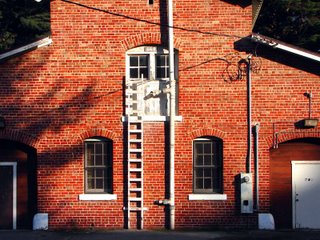
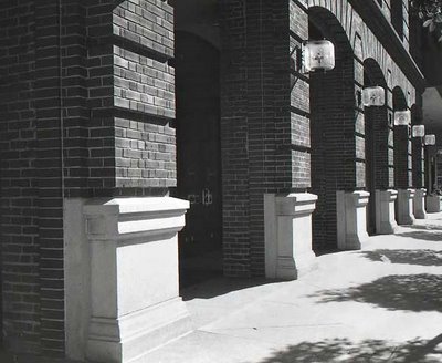
On this shot, I like the way the darkened shadows in the 4 corners create a vignette effect thus focusing the attention on the bricks. Nice.
--WT
Oh well...At least it wasn't the same type of shot as yours. Actually, I shot part of this building when I first started participating on the blog. OK, so I cheated. Shoot me.
Eric
Actually, it's great that you shot the same scene! It's fun and educational to see another photographer's vision of the same subject.
--WT
BTW, it's nice to see some color work from you for once :)
--WT
Thx Warren. I'm going to try to do more w/color. I want to experiment with it more to see what I can get.
Eric
When I looked at my original photo, the bricks looked a little washed out. To make up for that, I played with the color a little in Photoshop. It put the red back into the bricks.
Eric
Hi Warren,
Yes, I see what you were going for, and I think the general idea is excellent - the cuved roofline at the top is an attractive shape, and combned with the diagonal flow of the letters' shadows.
What keeps this from being a really excellent image is the burnt-out hightlights in the upper right. I'm not sure about the "UNION" sign - maybe you could try cropping it out - I think the remaining image would still be very strong.
If it's not far away, I'd consider going back there at the same time of the day - the lighting you caught is great - and trying again with some bracketing to try to save the very nicely textured highlights along the top.
Meanwhile, hello to all - I've hardly taken any photos lately, but I've been lurking in the Forum - otherwise life is good. Just need to force myself to pull out the camera and click that shutter - hopefully I'll have something to post soon
Best regards,
SteveR
Hi Steve,
I managed to lure you out of lurk mode! :) Why don't you grab one of your classic FSU cameras and go for a walk? BTW, the guys on the Russian Cameras mailing list were wondering about you.
Thanks for the comments. They are all very good points.
When I saw this scene, I knew that the dynamic range of it would be problem, so I DID bracket and recompose. I shot 3 frames in total. This one here is the first frame that I knew would have blown highlights.
The next one (which I will post here) followed almost the same composition, but was exposed for the highlights. I was not sure about including the Union Street sign, and whether or not it would mean something to San Franciscans. I cropped it out for this version here.
The third, that I won't be posting, was recomposed, but it eliminated too much of the curved part of the building.
--Warren
How about this, Steve, go shoot something of a genre that you haven't done lately. How about landscape or cityscape, or B&W? :)
Just tossing out some ideas :).
--Warren
If you (or anyone else here)
have an idea for a joint project, I'm game for that too!
--WT
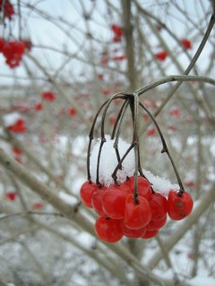
Great picture, Lea!
The red berries really stand out and contrast well with the white.
--WT
Very nice photo, Lea. Good composition and the red really stands out.
Eric
Thanks :)
They really stood out when I walked by them too! Browns, and greys.. and --ooo-- RED!
I don't miss snow very much at all except when taking photos in the winter. It can make for some really nice background and contrast. You took good advantage of it.
Eric
Different kind of photo subject! :)
I really like it in black and white too! It makes that face stand out very clearly agains the dark wall.
Thx Lea. Actually, the graffitti was done in black, white and gray. This wasn't here a couple of wks ago. I like graffitti art. I think the artist did ok here.
Eric
Nice composition. I like the relationship between the lines of the alley/wall and the picture of the face. There is good contrast and tonality in this picture. The face really stands out (pops).
--WT
Thx Warren. THe contrast tool really helped the effect a lot. This was a fun photo to take. I want to go back to it and take some shots straight on. I seem to take too many pix from an angle.
Eric
uh...Tom, did you have an unpleasant graffiti experience lately? :)
--WT
this is getting a bit off-topic. nobody here is condoning defacing private property. we're talking about pictures here.
i can sense your anger, but this is not the place to vent.
--WT
Wow, pin sharp focusing on the duck's head. Did you buy the 10D?
--WT
Great photo! You can see the water beads on his face and neck :) oof, he is trying so hard to take off! I can just hear the flapping of those wings. Nice capture of effort!
I haven't bought the 10d yet. Difficult to figure out what to get. I am considering a Canon Digital Rebel XT. The new Nikon D80 and D200 are good too but I have Canon AF lenses. Maybe a 30D? Too many choices these days.
There's a double rebate on the 30D right now. Up to $200 off the price of the camera. Of course the 20D is now down to 895 new or as low as $600 used. And there's the $600 off the price of the 5D.
One of the things I missed on the Rebel XT/XTi is the control dial on the back. Dialing in EC in 1/3 stops without having to dig through a menu is pretty convenient.
Great shot capturing the emotion of "the moment"! You can feel the guy digging into the note and the joy he's getting out of it. Nice!
Then the guitar player in me takes over and notices that (1) he's playing a Stratocaster with a rosewood fingerboard, (2) some serious string bending going on; from a high G to an A or even Bb, (3) looks like he has the pickup selector switch on the neck pickup, which is kinda unusual for most solos, and (4) I think it's a single-ply pickguard, which would make it a 1950's style reissue guitar. [long sigh] Guitar players can be geeks too :)
Thanks for sharing this!
AL
For those of you who don't know Al, he's my dear friend who has been lurking here since we started. Now, over two years and 900 pictures later, I finally made a picture that enticed him to de-lurk and say something! :)
Al, thanks for posting the comment. Now that you started, I hope you continue.
It's amazing what details an expert can see. To me (duh!), it just looks like "a guitar". :)
--WT
I like this photo a lot Warren, great capture of his expression, and the background window or wall lines, and lines of the mic work well.
Great info. on the guitar and playing Al! I used to have a 50's reissue strat with maple neck, but now only have a MIJ '57 reissue strat, MIM std tele, and LP special (reissue from '90s). The strat is in Japan, the tele and LP get played a lot.
Nice photo, man. Caught him when he was in Heaven.
Eric
Hi Ted. At the risk of boring the other forum members, yeah, the MIJ Strats are really fantastic instruments! I've got a '50's reissues myself that I had Rene Martinez (guitar tech for Stevie Ray Vaughan and Carlos Santana) re-do the neck and frets. I've got a boatload of other guitars, but the main ones are a 1973 Les Paul Custom and a Line 6 Variax.
AL
Al, which guitar were you playing that night? Just wondering...
--WT
It was the Line 6 Variax (http://line6.com/variax/), which is a modeling guitar that can emulate 25 different types of guitars. Ideal for a cover band situation where you need to have lots of different sounds and the ability to switch to alternate guitar tunings. I had it hooked up to a Line 6 Pod XTLive pedalboard (http://line6.com/podxtlive/), which emulates 42 different types of guitar amps. Too many choices!
Hi Al, sounds like a great setup. I know of Rene, but haven't had him work on my stuff. Larry Cragg has been working on my guitars since the mid'70s, and Sal Trentino has tended to my amp collection, and built me a custom amp since the mid '90s.
While sitting and working on a puzzle with my boyfriend (yeah, we're kinda dorky), I noticed that this area might make for an interesting shot.
I liked that the blue was a slight contrast in colour to the surrounding picture.
And afterwards, I really liked this photo because of that slight lift in the puzzle piece in the centre. It seems to brings something different to the expected flat world of a puzzle. Yay puzzles! :D
Interesting photo, Lea. When I first saw it, I thought you took a picture of a giant puzzle in an outside exhibit. Very interesting. I thought the tree in the lower left was a shadow from an actual tree. Just sharpening the photo a bit is the only thing I can see. Kind of an artsy photo.
Eric
this is a nice photo Lea. What is the puzzle a picture of, and how many pieces? We did a 300 piece puzzle of a baby white tiger over the holidays, and then dragged out a 500 piece puzzle that we had given up on a couple of years ago. I'm glad we didn't embark on the 500 piece one, and hope to put it away fast!
Lea, I like this picture too, for the same reasons that you mentioned :).
--WT
Thanks for the compliments & suggestions :)
Giant puzzle -- that would be cool! But that's the beauty of macro shots. When you are viewing them, your imagination can have fun pretending you are the size of an ant! If only it were summer I would go out looking for ant hills now with my camera...
This puzzle was 1000 pieces. It is a beautiful landscape scenery with houses scattered on a hillside with sheep and cows, and mountains in the background. And now I want to make a puzzle out some of my photos!! LOL :D
4 Comments:
Nice, Steve! I like the banding effect.
I think this would also look great as a high contrast B&W. I'll email a version of it that I made for fun.
--Warren
Nice pattern, Steve.
Eric
Very interesting pattern Steve, At first glance it looked like something cut and pasted, then looking closer, it's just a great angle for that effect.
Nice pattern, and the angle gives a different feel.
Post a Comment