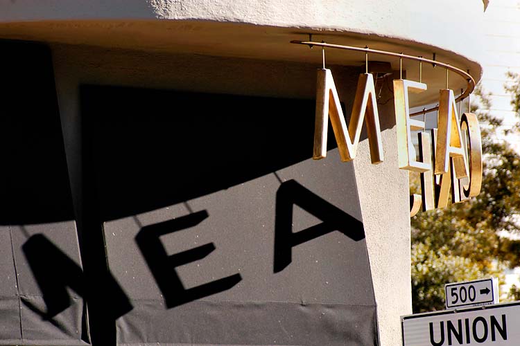
Sign and Its Shadow
Nikon D100, Tamron 24-135mm
I'm not sure if this shot has any merit. I'm posting it for your comments.
Anyone?
On an administrative note, Blogger.com has been pushing for us to move to the "new" Blogger. When I do so, you may need to create a Google logon before you can continue to use Blogger like before. I think most of you already have Google logons because of the FPCF Google group. I'll be switching the forum to the new Blogger soon.
--Warren
Frame #2:
posted by Warren T. at 2:21 PM
4 comments
![]()
![]()

4 Comments:
Hi Warren,
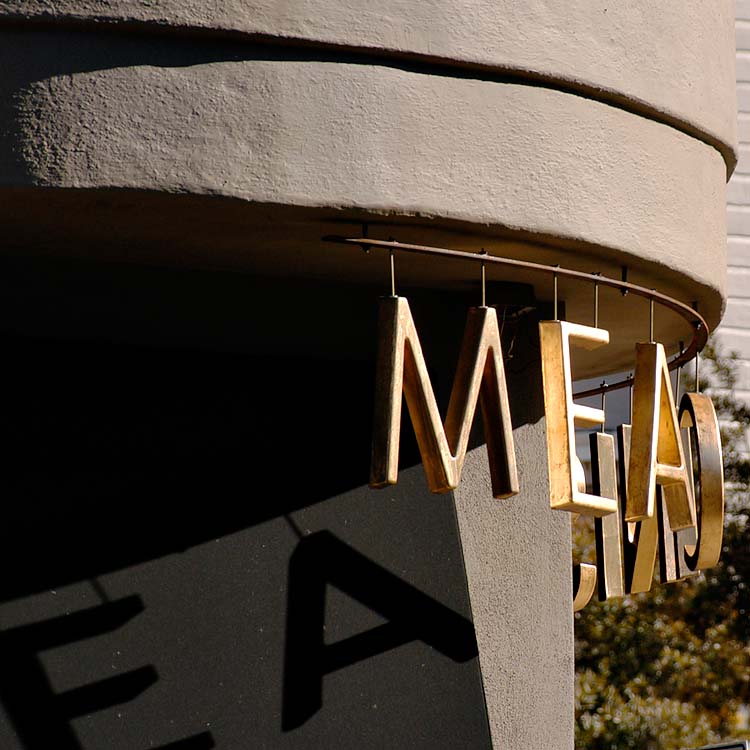
Yes, I see what you were going for, and I think the general idea is excellent - the cuved roofline at the top is an attractive shape, and combned with the diagonal flow of the letters' shadows.
What keeps this from being a really excellent image is the burnt-out hightlights in the upper right. I'm not sure about the "UNION" sign - maybe you could try cropping it out - I think the remaining image would still be very strong.
If it's not far away, I'd consider going back there at the same time of the day - the lighting you caught is great - and trying again with some bracketing to try to save the very nicely textured highlights along the top.
Meanwhile, hello to all - I've hardly taken any photos lately, but I've been lurking in the Forum - otherwise life is good. Just need to force myself to pull out the camera and click that shutter - hopefully I'll have something to post soon
Best regards,
SteveR
Hi Steve,
I managed to lure you out of lurk mode! :) Why don't you grab one of your classic FSU cameras and go for a walk? BTW, the guys on the Russian Cameras mailing list were wondering about you.
Thanks for the comments. They are all very good points.
When I saw this scene, I knew that the dynamic range of it would be problem, so I DID bracket and recompose. I shot 3 frames in total. This one here is the first frame that I knew would have blown highlights.
The next one (which I will post here) followed almost the same composition, but was exposed for the highlights. I was not sure about including the Union Street sign, and whether or not it would mean something to San Franciscans. I cropped it out for this version here.
The third, that I won't be posting, was recomposed, but it eliminated too much of the curved part of the building.
--Warren
How about this, Steve, go shoot something of a genre that you haven't done lately. How about landscape or cityscape, or B&W? :)
Just tossing out some ideas :).
--Warren
If you (or anyone else here)
have an idea for a joint project, I'm game for that too!
--WT
Post a Comment