Variations on a theme
Along the same lines of my previous post, I would like to offer the following variations on a theme. The shot was an uncorrected, unprocessed, jpeg straight out of the camera and mutated via Photoshop. Thoughts?
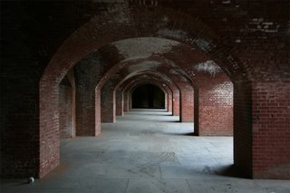
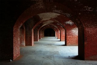
Original shot

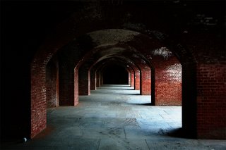
Straight desaturate
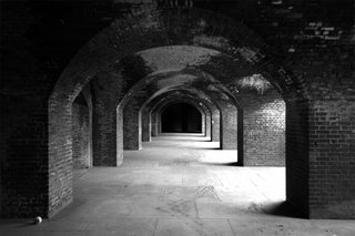
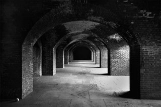
High contrast monochrome via channel mixer
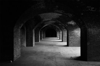
Illford HP5 400 pushed 1 stop
Kodachrome 64
Velvia 100

Cross processed C41 in E6 chemicals
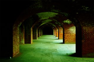
Lomo cross processed Fuji
------------------------------------------------------------
I made this version from Tom's original shot, posted with Tom's permission. (see comments)
--WT

Original shot

Straight desaturate

High contrast monochrome via channel mixer

Illford HP5 400 pushed 1 stop

Kodachrome 64

Velvia 100

Cross processed C41 in E6 chemicals

Lomo cross processed Fuji
------------------------------------------------------------

I made this version from Tom's original shot, posted with Tom's permission. (see comments)
--WT
posted by Anonymous at 12:00 AM
7 comments
![]()
![]()

7 Comments:
When I first looked at them, my favorite one was the Velvia 100. The brick colour is bold and the floor seems very clear and bright. But then I was thinking about what message you might be wanting to portray (potentially).
The red brick pictures are the most attention grabbing. Likely because of the red.
The black and whites make me think "historical value" and prompt factual questions like where is this, when was it built, what was it used for, is it still used today. And a bit more specifically, the high contrast monochrome pic reminds me of textbook photos or ones in museums. Maybe because of the brightness and slightly faded look.
If I were to choose one word to describe the last picture it would be solitude. The greeny/yellowy tint kind of gives it the feeling of impoverished and desparate times and could be a scene in the movie Angela's Ashes. It has that mossy look to it.
All of them are great pics, but maybe for different reasons :)
Tom,
Thanks for this very interesting comparison and exercise!
Here are my thoughts on the various versions:
- Original Shot: this needs some obvious post-processing to bring out its potential. It needs some levels adjustment at the very least.
- Straight desaturate: This technique works to give you a quick view of how the image would look in B&W, but it does not give enough control over how each color is represented or corresponds to a shade of grey, therefore it is not the ideal way to convert a color shot to B&W.
- Channel Mixer: I personally use the channel mixer to convert my own color shots to B&W, but I usually tweak with other tools in PS before I am satisfied with it. Of the B&W versions, I like this one the most.
- HP5 +1: This one lacks the contrast punch of the channel mixer version, and the artifical grain is a bit muddy, and I think actually detracts from the image.
- K64: This is my favorite of the color versions because of the (IMO) natural rendition of the red bricks, and the good details visible on the floor. It's a bit cool feeling, but that's probably how the scene felt when you were standing there.
- Velvia: I think the reds are unnaturally oversaturated on this one, and the floor details are not clear, but it does produce a warmer feeling to the shot.
- C41-E6: This is very similar to the K64 version, but with maybe a slight edge in contrast. It's a tossup, this one is nice too.
- Lomo: Unless you use this for a special effects shot, this unnatural version doesn't do it for me.
In my opinion, the most important question is: Tom, which version best represents how you saw that scene, or alternatively, which version would you show if you could only show one?
I also made a version from your original. Would you like to see it?
--Warren
Tom, these are all great. I especially line the 2nd and 3rd ones, along with the last lomo/fuji one.
Tom, I added my version to the end of this post. BTW, nice shot! Where is this?
--Warren
So what are YOUR thoughts on the different versions?
--WT
I like the Kodachrome version the best. Mama, don't take my Kodachrome away-ay-ay-ay-ay!
Besides the different versions, I really like the composition of the repeating, receding arches and the red/black color scheme.
Thanks for the amount of work and patience you put into this!
So, Tom, what are YOUR thoughts on the versions that you posted? Inquiring minds want to know :).
--WT
Post a Comment