Positive Space, Negative Space


Thanks to Warren for getting us thinking along these lines.
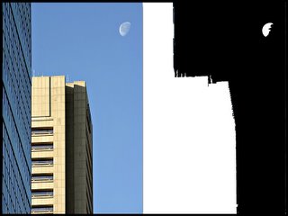
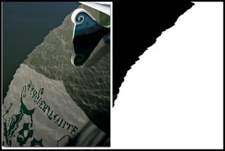
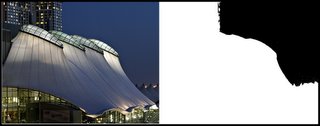
I really don't know exactly where I'm going with this - but I played around a bit in Photoshop Elements with the magic wand selector to try to reduce a few of my photos to the positive space and negative space elements.
For what it's worth, here is my first crack at this....

9 Comments:
Hi Steve,
Thanks for contributing another thought provoking article. This is good stuff!
This exercise is very interesting. However, being new at this type of analysis, you need to help me understand what you can conclude about these 3 pictures based on this sort of comparison. Are the positive and negative spaces supposed to balance? I need to study those articles some more...
Also, in looking back at some of my posted pictures, I find it very hard to draw the line between positive and negative space elements because of the complexity of the composition. Hmmm...
Let's not over-analyze this stuff and give ourselves headaches :). Maybe I need to have a beer first before thinking too hard about it :). As long as we're having fun with it, it should be okay, right?
Hey, what about you guys out there who might have already been there and done that? Please speak up!
--Warren
Hi Warren,
I haven't drawn any conclusions about these yet - in fact I "cheated" and chose these 3 because it seemed easy to identify the positive and negative spaces - in fact Photoshop's Magic Wand selector did all the work ;-) In many other cases, it's not so easy.
The one thing I did notice is that in the "Moonrise over Legg Mason" photo, the negative space is very close to an inverted mirror image of the positive space.
-- SteveR
Hi Steve, This "space" stuff is surely something new to me. Like Warren, one of my questions is "Are they suppose to balance?". My other queries are (a)What are they for? (b) How important are they in the structuring of a good photo? and (c) Are we suppose to consider this "space" factor when taking a photo or afterwards via Photoshop?
PAT
Here are some more thoughts on this topic:
I think understanding these concepts and going through this exercise helps emphasize the fact that negative space (the space that is not part of your main subject) is as important a part of your composition as the main subject. By deconstructing the image into black and white forms, you only see the relationship between positive and negative strictly as design elements, thereby making it easier to judge the balance between them.
Having a balance between the positive space, negative space, and the frame of an image is usually deemed to be a good thing.
The knowledge of this and other design concepts may help us articulate better why a particular image works better than others.
To the questions that Pat posed, here is my opinion:
1) I think good structure helps make a photo better, but it's just a small piece of the puzzle.
2) I think "space" should definitely be considered when taking a photo. For example, adjusting depth of field to snap an intrusive element out of focus, and more into "negative space", would be something done when taking the photo. Of course, you can always use the blur tool in Photoshop to achieve a similar effect, but in my opinion, some things are best done when taking the picture.
--Warren
While in design school the design professors all indicated that negative space is a very important aspect of design. It doesn't get the attention that it deserves. Guess the photos point that out.
Eric (Warren's brother-in-law)
Hi Eric! Nice to finally hear from you here on the forum.
You were in design school? Holding out on us eh? So you must be very familiar with these things that we're starting to discuss here.
You gotta join us and start posting some of your shots. I've always admired the photos that you display on your walls of your house.
--Warren
Hi Eric,
"...You were in design school? Holding out on us eh? ..."
Family secrets, huh? I'm glad it's now out in the open :-)
I'm glad you joined this discussion, because I was going to Pat's excellent questions with a big "I don't know" - but I sure would like to know. I hope you can shed some light on this topic for us.
This whole thing has gotten me seriously thinking about enrolling in a basic drawing course at our community college - not necessarily to learn how to draw, but to learn some of these basic design principles.
Meanwhile, I encourage the rest of the gang to try what I did in Photoshop or similar image editor and see what results.
Best regards,
SteveR
Steve,
I also highly recommend the book, Drawing on the Right Side of the Brain by Dr. Betty Edwards. I think there may be an article or two with excerpts from it on Apogee. I bought this book a while back, and really enjoyed it.
--Warren
Warren and Steve:
I am a cruddy free hand drawer, but I remember how those classes really made you look hard at your subject and see things that you did not see before.
I neglected to say that I dropped out of design school after 2.5 yrs. I knew when I was beat.
Eric
Post a Comment