Mural Project
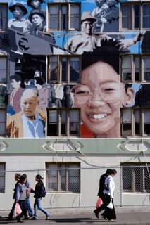
I volunteered my time to make a picture for the cover of a Chinatown Health Report. The designer wanted a picture of the giant mural on the side of the Ping Yuen building in Chinatown. They already had a shot of just the mural. They wanted me take some that possibly included some of the local residents in the picture. It was a fun project. Following were the shots that I gave to them to choose for the cover.
Which one do you like, and why?
--Warren
Camera: Nikon D100, Tamron 24-135mm and Sigma 15-30mm


Which one do you like, and why?
--Warren
Camera: Nikon D100, Tamron 24-135mm and Sigma 15-30mm


8 Comments:
okay, don't everyone speak up at once :)
I forgot to mention that if you'd rather not make a public statement, feel free to answer my question in a private email. This goes for any other post of mine or anyone else's for that matter.
Happy Shooting!
--Warren
It's difficult to make a selection without further information. Why photograph the mural? Is it a part of a story?
None of the frames really stick out. Maybe the last one. I would have wanted to see more people in the shots.
I didn't really drill the designer on why she wanted the mural in particular. She originally had a number of smaller photos of Chinatown residents for the cover. Then she decided that she wanted the mural for the cover. The report is (I guess) an annual report on the state of health care in Chinatown.
She already had a photo of the mural that just showed the mural only. They decided that they wanted to see some residents along with the mural. That's what I was out to shoot for.
--Warren
Be careful with the legality of photographing any mural for commercial use. Murals are often considered artwork and may be subject to copyright. What does the mural have to do with health care in Chinatown? Sounds like the designer is trying to use someone else's art.
Thanks for the copyright advice, and it is well taken, but...
The artist is being credited in the report along with the name and location of the work. I'm sure they have the artist's permission to use the work in the cover of the report, and I am being credited in the report. The report is for a non-profit organization. This is not the first time that this organization has done this, nor will it be the last.
This is a professional graphic designer, and I don't think she would be stupid enough to put a picture of someone else's art into her work and either claim it as her own art, or not give credit where it is due.
As for what the mural has to do with healthcare in Chinatown, that beats the living crap out of me. How the hell can I get into the brain of that designer and the executive director of the non-profit for wanting to do that. Apparently, it means something to them. However, if I were to guess, I would suggest that since this report is about the demographics and health statistics of the Chinese population in Chinatown, they wanted the cover to show something that is unique to Chinatown, that maybe represents the Chinatown community, that everyone knows where it is when they see it.
I've seen a mockup of the cover, and I think that it does indeed work well with it. I also liked the previous design, which had consisted of a collage of pictures of Chinatown people doing various ativitiies in it.
The report is not sale, and the target audience is not the general public, but probably affiliated health care institutions and funding sources.
--Warren
Based on what it will be used for, I like the first shot. Mostly because it shows a larger part of the mural. The other shots are nice but don't really do much for me. The one with the no parking sign is an interesting perspective but the sign is distracting.
Thanks for the comments. As it turned out, they used the first shot.
--WT
I agree about the usage of the first shot for the cover. My personal favorites are the last couple of shots because I feel that the mural and the actual people are better "integrated" into the picture from that perspective.
Anyway, it was a fun thing to do.
--Warren
Post a Comment