Sunday, July 31, 2005
Saturday, July 30, 2005
3 Comments:
- Warren T. said...
-
Hi Martin,
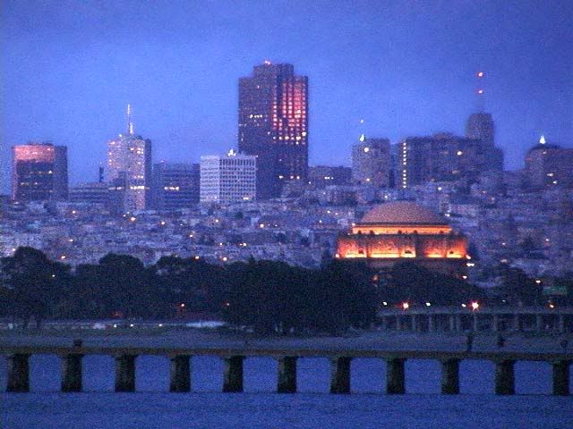
Nice vivid colors on the building and sky! I see some banding in the sky, I wonder what caused that.
Just a thought...it might be a bit more dramatic if the lake reflection was a bit stronger. Also, for me, the pitch black middle portion (with the trees) is a bit "uncomfortable" to look at. The darkness draws my attention away from the building because I find myself wondering too long about what's in the darkness.
I like the ducks in the foreground too.
--Warren - martin said...
-
I didn't notice the banding. I looked at the file I uploaded and it doesn't have any banding. Must be something with Blogger, maybe the files are getting compressed after uploading. Thanks for the comments.
- Warren T. said...
-
Yeah, I think Blogger.com may be compressing the files after uploading because I noticed some compression artifacts on my recently uploaded picture (Lottery Dream).
--WT
New Addition To My Nikon Collection...
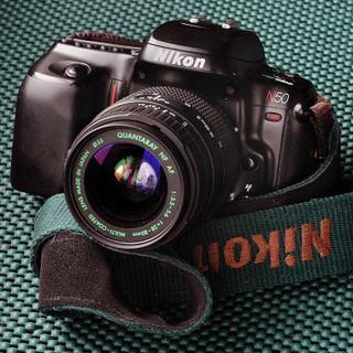
...and the best part is that it was essentially FREE!
Last week, I spied an ad on Craigslist for a Nikon N50 with lens and Nikon SB-28 Speedlight for $50 (!!!). So I did some research on the N50 and learned that it is an entry level body from the 90's. I've been thinking about finding a replacement for my aging, but still working SB-24 Speedlight, and the SB-28 would definitely be an improvement. I knew that the SB-28 by itself normally sells for over $100 used. If this deal was real, it would be a great price for the three pieces of gear. I researched prices of used N50's, and found that they normally sell for $60 and up depending on condition.
So, I emailed the seller and said that if everything worked, I would come by after work to pick up the camera and strobe. The seller replied to confirm the address, but I noted that he never confimed that everything worked.
When I got to the house, I examined the equipment. The N50 powered up, but I noticed that the lens seemed to be sluggish. I noted that the lens was a cheap, Quantaray 28-80mm. I was most interested in the SB-28, and I found that it was in almost new condition. The strobe powered up and I was able to test fire it. Without further ado, I handed over the $50 and left.
When I got home, I examined the camera more closely and I found to my dismay that the focusing ring on the lens was frozen. To check the camera, I swapped on one of my Nikkor lenses, the 50mm f1.8D. I was pleased to find that the N50 seemed to work fine. I downloaded a N50 user manual to learn how to operate the camera's very odd user interface (all buttons, no dials). I learned that the camera can operate in both "simple" mode and advanced mode that allows program, shutter, aperture, and full manual modes...not bad for an entry level camera. So, I was pleased that I had a fully functioning body and a like-new SB-28, all for $50.
I almost trashed the lens, but I thought better of it, and the next day I decided to see if I can fix it. As it turned out, all I had to do was tweak the AF screw on the back of the lens a little, and it freed up the focusing ring. I mounted it back onto the N50, and it worked!!! This Quantaray lens (manufactured by Sigma) is very poorly constructed, but at least the glass is clean. I think it's used value is around $40.
The N50 is the polar opposite to my F4s, one is entry level, while the other is the flagship of that era. Where the F4's shutter mechanism is well damped and ultra smooth, the N50 goes "KERRPLOPPP..ZZZZZZZZ" when the shutter is tripped (very loud). On the other hand, the N50 is probably half the weight of the F4, and since it cost me nothing, it would be a great go-everywhere, toss it in the trunk kind of camera.
Of course, you know that I like cameras of all vintages and qualities because I believe that it's up to the photographer to get the most out of whatever equipment is available. So I like to play with all different sorts of gear.
I will get the test rolls back soon, that I shot with the N50 and share the results with everyone. I hope you enjoyed this little camera story.
--Warren
Wednesday, July 27, 2005
2 Comments:
- Warren T. said...
-
Hey, that works pretty well. I guess we don't have to use Hello either.
By the way, nice colors! You've been doing a lot of nice color work lately! And I always thought you were strictly a b&w type of guy :)
--Warren - martin said...
-
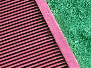
This photo was done for a color class back in 2003. The assignment was to photograph complementary colors. I found this green magenta combination on the side of a home on Ortega St.
Monday, July 25, 2005
Wide shot - Before and after

After

This is the Conservatory of Flowers in Golden Gate Park. Photo was shot on a Canon digital camera and stitched with Canon software. I shot this on an overcast day which washed out the sky (first photo) and then added a blue sky with Photoshop. The difference in the two photos is interesting. Is the photo with the blue sky believable?
3 Comments:
- Warren T. said...
-
Very cool, Martin!
You did a great job on the "after" version. I wonder if the image holds up when enlarged.
So, this image is a stitch job, right?
--Warren - martin said...
-
It's a stitch of three frames. Image quality should hold up to a 15 inch print or so. I used a 3 megapixel camera for this.
- Warren T. said...
-
very nice. I bet you can find some buyers for that.
--WT
Sunday, July 24, 2005
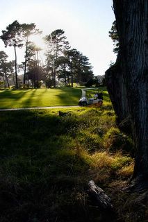
Sunset on the Golf Course, NIkon D100, Tokina 17mm, 1/250 f8

One of the characteristics of this particular lens is the very well controlled flare. I shot this directly into the sun, and there was just the slightest hint of flare that I could have easily cloned out in Photoshop, but I left it in here to show you. If I had shot this with my Sigma 15-30mm zoom, I think the potentially large flare problem would have made such a shot unusable.
--Warren
Friday, July 22, 2005
Thursday, July 21, 2005

Portrait of Dolph, July 18, 2005, Nikon D100

Dolph was in town! He came by for a visit and brought his Lowepro photo backpack full of new toys. Here he is holding his new D70. Yes, I know, the direct flash (built-in) threw some harsh shadows, but sometimes you just have to go with what you have at the moment.
--Warren
Wednesday, July 13, 2005
3 Comments:
- Warren T. said...
-
Dolph, you're not kidding, that is an ugly duck! What kind of duck is it? Is it a mutant of some kind?
The long telephoto with its shallow depth-of-field really gave a nice, blur to the background.
This picture has the potential to be better than it is now. You need to adjust the levels a bit, then apply some sharpening. I opened it up in Photoshop, and noticed that the colorspace used is Adobe RGB. If you plan to show this on the web, you should convert the picture to the SRGB colorspace, otherwise, the computer monitor will not accurately show the picture's colors.
If you'd like, I can post a version of this picture that I adjusted a bit. Alternatively, you can play with it a little yourself to see if you can improve the look a little.
Keep up the good work, and the posts to FPCF! We all really enjoy seeing your pictures!
--Warren - Warren T. said...
-
Dolph, I forgot to mention that if you prefer not to have to post-process your shots as much, you may want to look into changing some of your D70's settings. Not sure if you can do this on the D70, but check the colorspace setting to see if you can change it in the camera to use SRGB. Also, check the camera's sharpening setting, you may want to bump it up a tad.
There are tons of other things that you can do either to the settings or manually, that I'm sure you'll find as you use the D70 more.
--Warren - Benson said...
-
I was just going to post a note saying that is one ugly duck!! Nice close up profile focusing on the main subject and no other distractions in the background.
I have a D70 myself and I know that Tony does also. What lens did you use with this shot? Another option you can use that I have been using lately is shooting in RAW so you can do a lot of processing after with white balance, color, sharpness etc.
Friday, July 08, 2005
2 Comments:
- Unknown said...
-
Dolph,
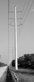
This shot makes good use of 1 point perspective to convey a strong sense of depth (all of the lines converge on a single horizon spot). The element that strikes me the most is the wires coming from the top right because they come into the frame from a slightly "off" angle before they hit the pole. That variation makes an interesting element because everything else travels to uniformly to the vanishing point.
I would like to see more of the road, it feels a little cut off. I think that might be remedied if at least part of it was on the bottom of the frame.
tc - Warren T. said...
-
Dolph,
Nice picture! Your choice of black and white and narrow vertical format for this shot served to accentuate the feeling of drama and perspective. Very nicely seen!
I was wondering how you did the b&w with your D70? Does the D70 have a b&w mode?
I'm looking forward to seeing more posts from you now that you're so well equpped!
--Warren
Thursday, July 07, 2005
1 Comments:
- Warren T. said...
-
Nice shot! I like the composition and color. The illumination from main building leads the eye to the other illuminated buildings. It's very pleasing to view.
It's unfortunate that there is a lot of digital noise on this shot, which detracts from the pleasant quality a bit. Ordinarily, film grain might add to the mood, but in this case, the noise detracts from the mood, in my opinion.
--Warren

Landmarks Take 2, 7/4/2005, Nikon D100

You may remember the original picture that I posted a while back. That one was taken on July 4th of 2003, two years ago. This July 4th, I went to the same spot to do another version. For those of you who are not familiar with the City, the three buildings in the background are famous SF landmarks, Coit Tower, Transamerica Pyramid, and the Bank of America building. I guess that I am insinuating that the carousel is or should also be a SF landmark.
Take 1 is here:
http://fpcf.blogspot.com/2005/02/landmarks-san-francisco-nikon-d100.html
--Warren
2 Comments:
- martin said...
-
I like the first one a little more than this one. The second one is a bit too balanced as most of the elements are the same size. The color is a bit weak.
- Warren T. said...
-
Just experimenting here with the pano format... Now that I look at it again, I don't think it works well as a wide format shot. The shot "looks" like it's missing the lower half of the picture. I cropped it that way to show just the top of the carousel and how it is similar to seeing the tops of the 3 landmarks in the background. The telephoto compression effect makes this more apparent. Unfortunately, the similar sizes of the 4 objects makes the "main" subject rather vague, so the eye doesn't know which one to focus on. Maybe if the carousel top had more POP to it, or if I had shown more of it, the picture might work better.
Anyway, that's about all that I'm going to do with this idea. Unless someone out there wants to see something in particular, I'm done here.
--WT
Wednesday, July 06, 2005
4 Comments:
- Warren T. said...
-
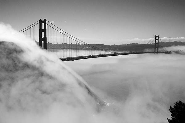
All your fog shots make me feel like going out to shoot some too!
In this one, I like the way the fog is hugging the hillside.
--WT - martin said...
-
Lots of times when it seems fogged in, the fog is very low and if you can get to a good hill above the fog, good shots can be made. This shot is a bit unusual as it was made in the middle of the day. It almost looks like a night shot.
- Benson said...
-
This one is so ethereal. Warren already said it but I too like how the fog rolls off the hillside.
- Dolph Brust said...
-
While sitting in hot Southeast Florida, and to quote my son....this is cooooool. I like to combination of the flow of fog with the rigid lines from the bridge.
6 Comments:
- SteveR said...
-
Bravo, Warren!
Both this one and the last Building Abstract are great examples of the species. I like the way you used the converging, repeating patter on the windows on the tower and the way you used the structure to frame itself. - martin said...
-
This one is much better than the earlier one. The diagonal lines make it much more dynamic. The other one was ok but this is much better.
- Warren T. said...
-
Thanks for the comments, guys. It's funny, I thought the same thing when I was post-processing #2. I thought it had a much more dynamic feeling than #1. I only took these two shots at this location. On #1, I saw the geometric shapes that made triangles out of the building and its base, and I wanted to precisely show what I saw. In #2, I considered the building more as a building, and composed it to show it a little better and in a more dramatic fashion than #1.
I find that I have to make a conscious effort to think beyond my own comfortable tendencies to make things too orderly and precise (as in #1). I liked #1 too, but in a different way than #2.
As always, I'm curious as to what you other folks think. Hey! This is supposed to be a forum for sharing ideas, please take advantage of this! (off of soapbox now).
--Warren - Unknown said...
-
I really like the geometry of this one, the repetition of the triangle creates an overwhelming unifying feeling, creates a pattern for my eye to follow through the image, and creates a frame within a frame for the focal element. I think this shot makes better use of the full frame than the first.
- Benson said...
-
There goes Tony again with his newly acquired design knowledge. I'll just make a very simple comment and say I like it much better also. Other comments have already been made but it I feel it makes a more dramatic impact when the black silhouette is not parallel with the frame as with the first shot.
- Warren T. said...
-
Hey Tony, you have to post a picture so that I can try that fancy design language on you. Of course, I would have to fake it since I didn't take the class :).
--WT
Tuesday, July 05, 2005
1 Comments:
- Warren T. said...
-
Hi, does anyone else notice that I probably dodged Gail's hair just a tad too much? On my desktop pc's monitor, it looks perfect, but when I view the picture from on my laptop, I see a problem. I will probably do this over and repost this picture. I need to calibrate my monitors one of these days.
let me know how it looks from you end.
--Warren
Monday, July 04, 2005
1 Comments:
- Warren T. said...
-
I'm surprised nobody said anything about how I was able to trip the shutter at the precise moment that the seagull was over the flag :).
But I suppose the shot would be "really" special if the bird had been a bald eagle rather than a common gull :).
Is this just another "ordinary" tourist shot of Coit Tower?
--WT
2 Comments:
- martin said...
-
Nice shot. I like the eyes, expression and the quality of the light. Good tonality. What does it look like in color?
- Warren T. said...
-
Thanks Martin. I chose to present this picture in B&W because I thought that the large blue bib that Darren was wearing was too distracting in the color version, even though the rest of the shot looks fine in color. By making it B&W and de-emphasizing the large swatch of blue, you end up concentrating more on Darren's face and eyes. Actually, Gail says that she likes the color version better. I liked the B&W version.
--WT









2 Comments:
Try out your new flash? You have nice detail in the white fur and no detail in the black fur. Maybe a levels adjustment can fix this. Maybe the flash is exposing for the white. Try using available light.
No, I was testing the el-cheapo Quantaray lens. Yeah, a level adjustment would probably bring out some detail on the black fur.
thanks for the comment.
--WT
Post a Comment