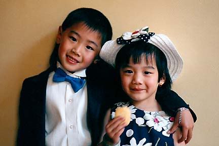
Kids portrait

Nikon F3, 85mm, 1/30 sec.@f/2, window light from right, handheld.
We are a small group of friends with a common love of photography. We hope to enjoy each others' work and to broaden our knowledge of photography and to stimulate our creativity by sharing our work and ideas here. Please invite your friends to stop by. If you are interested in becoming a photo contributor, please send me an email. --Warren
3 Comments:
The kids are very cute and charming. They must be very close, brother & sister? It shows. You must have a steady hand to be able to handhold an 85mm at f2, and still get such sharp results. The pose is great, very natural and fun.
It might be due to the scanning process, but at first glance, the picture is a tad on the contrasty side. There is little to no detail in the shadows and black areas. While using the wall as a background is uncluttered, I feel that it's a bit too stark compared to the festive and lighthearted mood of the kids. Because of the side lighting and the closeness to the wall, there is a disturbing dark shadow next to the boy's head. If there was time to set it up, perhaps a reflector placed to the left of the shot would have opened up some of the shadows.
It's a great shot! Did you know these kids, they seemed very comfortable posing for you.
Thanks,
Warren
oops, meant to say: hold an 85mm at 1/30sec and f2.
WT
Thanks for the comments. Your comments are helpful as I have difficultly evaluating my personal work objectively. I shot the photo several years ago at a family wedding. The boy was the ringbearer and the girl, the flowergirl. I was not the official photographer and found them during a break after the wedding. I think the bride and groom were changing or something. We were in a hallway next to a window and I posed them with a little encouragement from their mother. I had little choice but to handhold the camera as I wanted to used the diffused light from the window. Sometimes you just have to take a chance.
As to the scan, this was one of the first I did with my home computer and I had problems as the neg was underexposed and the scan was bad. And what's worse was at the time, I didn't know how to properly correct it, all I knew was to use the auto levels or use the white eyedropper to set the white. Since then, I figured most of the stuff out. Interesting that you noticed that it lacked shadow detail as I actually made the photo worse by my Photoshop manipulations. The photo I posted is too contrasty and the black value too dark. I redid it and the photo has a softer look with a little more detail.
Post a Comment