Tuesday, May 23, 2006
Contributors
Links
- FPCF Home Page
- Rangefinder Forum
- Micro 4/3 Forum
- Serious Compacts Forum
- ViewfinderSF.com(Warren's web gallery site)
- Viewfinder-SF(Warren's SF Only Photoblog)
- Steve Rosenbach Photography
- Lea's Flickr Photostream (Lea)
- heart, soul, & a camera(Back Alley's Photoblog)
- Sweetfstop (Dan's new photo site)
- Lena's Aminus3 Photoblog
- Sweetfstop (Dan's new photo site)
Previous Posts
- Lulu for a Sunday Morning Drink
- Pink Flowers in Black and White
- Small Town Bridge
- Birds of a Feather
- May Project -- Welder
- Broken Window
- May Project -- A Cup of Joe Before the Morning's Work
- Another try at the horses
- Kinda of a Strange Sight
- Three Horses
Archives
- September 2004
- October 2004
- November 2004
- December 2004
- January 2005
- February 2005
- March 2005
- April 2005
- May 2005
- June 2005
- July 2005
- August 2005
- September 2005
- October 2005
- November 2005
- December 2005
- January 2006
- February 2006
- March 2006
- April 2006
- May 2006
- June 2006
- July 2006
- August 2006
- September 2006
- October 2006
- November 2006
- December 2006
- January 2007
- February 2007
- March 2007
- April 2007
- May 2007
- June 2007
- July 2007
- August 2007
- September 2007
- October 2007
- November 2007
- December 2007
- January 2008
- February 2008
- March 2008
- April 2008
- May 2008
- June 2008
- July 2008
- August 2008
- September 2008
- October 2008
- November 2008
- December 2008
- January 2009
- February 2009
- March 2009
- April 2009
- May 2009
- June 2009
- July 2009
- August 2009
- September 2009
- October 2009
- November 2009
- December 2009
- January 2010
- February 2010
- March 2010
- April 2010
- May 2010
- June 2010
- July 2010
- August 2010
- September 2010
- October 2010
- November 2010
- December 2010
- January 2011
- February 2011
- March 2011
- April 2011
- May 2011
- June 2011
- July 2011
- August 2011
- September 2011
- October 2011
- November 2011
- December 2011
- January 2012
- February 2012
- March 2012
- April 2012
- May 2012
- June 2012
- July 2012
- August 2012
- September 2012
- October 2012
- November 2012
- December 2012
- January 2013
- February 2013
- March 2013
- April 2013
- May 2013
- June 2013
- July 2013
- August 2013
- September 2013
- October 2013
- November 2013
- December 2013
- January 2014
- February 2014
- March 2014
- April 2014
- May 2014
- June 2014
- July 2014
- August 2014
- September 2014
- October 2014
- November 2014
- December 2014
- January 2015
- February 2015
- June 2015
- August 2015
- September 2015
- October 2015
- December 2015


4 Comments:
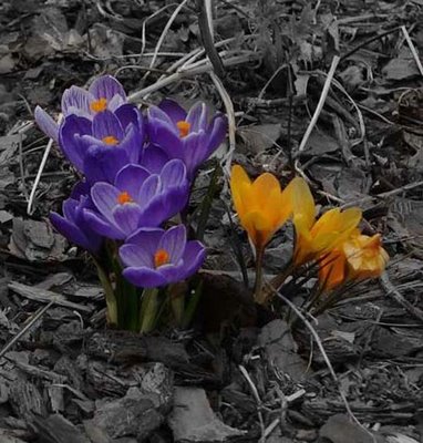
hi, nice work! The overall image looks a bit muted (dark) though, at least on my monitor.
--WT
Warren:
It looks a little dark on my monitor here at work, too. It seemed to look ok on my laptop at home. I'm gonna check it out when I get home. This monitor stuff drives me a little nuts sometimes. Trying to calibrate everything to be the same can be quite a chore. A guy here at work who does a lot of photography says it can be a problem with digital stuff. No joking.
Thx!
Eric
I used to have problems with my pictures being too dark when I printed them. I figured out that I had my Powerbook screen on maximum brightness which made the pictures appear brighter than they really were. Check the brightness of your screen. I have mine set around the midway point. I have an Adobe system preference that allows me to adjust the color and brightness of my screen and during the calibration it said to keep the screen to the middle brightness setting.
Thx Benson. I lowered the brightness already. Maybe I need to do a little more. I'll have to check. If you notice the 3 horses pic, I did that while the laptop was not plugged in which causes the screen to appear darker. Thus, the 3 horses pic appears too washed out on another pc. Ugh... Just have to play with this stuff.
Eric
Post a Comment