Tuesday, January 31, 2006

Moraine Lake, Canada -- June 2001

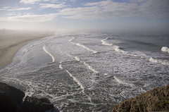
Nikon F4s, Nikkor 24mm f2.0, Kodak Royal Gold 200

Recent emails about travel photography reminded me how much I love travel photography myself. As you all know, family circumstances over the last few years dictated that Gail and I could not travel far from home. This picture was taken on our trip to Canada in 2001. It was our last trip out of the country, and it has already been almost 5 years ago. Fortunately, Gail and I have done some extensive traveling since the late 80's, and I've taken LOTS of pictures. I'll always have those pictures to jog the old memory. I'll need to scan some good ones to post here, but all in due time.

This is Moraine Lake, which is right next to Lake Louise. We decided to stay here for a few nights instead of at the busier and more touristy Lake Louise. This lake is frozen until late Spring/early Summer, so we actually delayed our trip until the Moraine Lake Lodge was open for the summer. Here, you can see that the lake was still half frozen (but melting fast). By the time we left, just days later, the lodge was getting ready to launch their canoe rental service for the summer. This trip was taken before digital cameras were practical, so I chose to carry my Nikon F4s with 3 manual focus prime lenses, 24mm, 35mm, and 85mm.

So I guess the bottom line is that I'm posting this picture to make a point. Just because the trend on FPCF has been towards discussions of photographic composition and design, doesn't mean that other forms of photography are not interesting to us. In fact, our discussions about composition and design principles are directly related to all types of photography, including travel photography. If one of us happens to go on a vacation somewhere, I fully expect our forum to be bombarded by marvelous pictures of interesting places. We just happen to be focusing our visions locally, because it's natural and convenient, and there are endless areas to explore in our own backyard.

In fact, I would say that "travel photography" is not so much a particular skill to learn, but I would submit that travel photography is merely an extension or continuation of your own photographic vision to where ever you happen to be at the time. In order to make good travel photos, you still need to meet the same criteria that you would need for any "genre":

1) A thorough knowledge of your equipment and medium
2) An understanding of composition and design
3) An understanding of lighting and exposure
4) An understanding of post-processing techniques and skills
5) A personal vision or "eye", or style, developed over time through practice, and trial and error

Thanks for reading.

--Warren

2 Comments:

Blogger Eric said...

Hey, I remember this picture. I remember looking at the water and being amazed at how clear and clean it was. Kind of unlike SF Bay.

Thursday, February 2, 2006 at 7:49:00 AM PST  
Anonymous Anonymous said...

A refreshing shot with great composition. One thing I like about taking pictures is that they help to refresh your memories of events of 5,10 or 20 years ago.
PAT

Saturday, February 4, 2006 at 7:18:00 AM PST  

Post a Comment

By Pat: PEPPER says "Kung Hei Fat Choy"

2 Comments:

Blogger Warren T. said...

Very cute shot of Pepper! Can you tell us a little bit about your portrait setup? (camera, lighting, etc.) Your series of pet portraits are really nice. In the future, if you want true high key, you can always include a background light to white out your background.

--Warren

Tuesday, January 31, 2006 at 7:29:00 AM PST  
Anonymous Anonymous said...

Thanks,Warren. Well, the set up included a main unit plus a fill-in placed at about 45 degree at the subject. I didn't use a hair light because Pepper has a light-colored fur on top. He was positioned on our dinning table covered with a white sheet against a white backdrop. The equipment was a Hassy with either the 80mm or the 100mm lens. The girls helped in "asking" Pepper to remain standing on his hind feet and raising his front paws.
PAT

Saturday, February 4, 2006 at 6:57:00 AM PST  

Post a Comment

Monday, January 30, 2006

We need to agree on Feb.'s Project Theme

Hi Gang,

Following are the "holdover" themes and new ideas:

- Wintery Weather
- Self Portrait
- Spring
- Animals
- Love

I would like at least 2 or 3 people to participate, it's no fun to play alone, right? Let's wait for 2 or 3 people to agree on a theme.

Any new ideas?

Reflections (Jan. theme) was fun.

--Warren

8 Comments:

Blogger Warren T. said...

By the way, the "spirit" of the monthly project exercise is to motivate us to get out and shoot pictures (FUN!). I don't mind if you have a recent shot to share, like within the last month or so, but in my opinion, Project shots should be new or very recent, and not from our archives (some of us have VERY old archives :) )

--WT

Monday, January 30, 2006 at 4:51:00 PM PST  
Blogger SteveR said...

Yeah, I really enjoyed the reflections.

Well, I vote for "Love", but all the other ideas sound fine to me, too.

-- SteveR

Monday, January 30, 2006 at 4:56:00 PM PST  
Blogger Warren T. said...

Steve, I already posted all my "love-themed" shots!!! (see all those "couples at the beach" shots :)) Just kidding...

Anyway, if 1 or 2 other people want to give it a go, I will too!

--Warren

Monday, January 30, 2006 at 4:57:00 PM PST  
Anonymous Anonymous said...

This being the start of the Lunar New Year and still quite the beginning of 2006, how about something the whole world and every individual is in need of---PEACE.
PAT

Tuesday, January 31, 2006 at 4:39:00 AM PST  
Blogger Eric said...

I can't decide. February has always been kind of a dead month for me - those New England winters as a kid formed some bad habits. I'll think some more and get back to you.

If the theme is love, I hope a bunch of my b&w's come out from this past weekend. They'll help me fulfull my contributions to the website (just joking). oh the pressure of assignments. JUst like being in school again.

Ej

Tuesday, January 31, 2006 at 7:44:00 AM PST  
Blogger Warren T. said...

Okay, how about this, folks?

- February -- Love
- March -- Peace
- April -- Spring

February is the month of Valentine's Day (love). Peace is a broad and interesting subject, I think it deserves its own month. April is a time when everything blooms (spring).

We don't have to scramble to think of themes for the next 3 months!

--WT

Tuesday, January 31, 2006 at 7:52:00 AM PST  
Blogger Eric said...

Sounds good! I'm on board! Oh, the pressure is on Professor Tang. You are a task master.

Ej

Tuesday, January 31, 2006 at 8:03:00 AM PST  
Blogger Warren T. said...

hey folks, I was just reading stuff on Rangefinderforum.com and I just found out that their February theme is also "Love"!

It will be interesting to see some of their pictures and compare them to our parallel efforts here.

I don't know about you, but I find this theme quite challenging (to capture a "different" perspective)

--Warren

Monday, February 6, 2006 at 6:32:00 PM PST  

Post a Comment

Sunday, January 29, 2006

By Eric: "The Haunted Barracks"

I was walking around the part of Crissy Field where the army barracks are located and I caught this barracks at an odd angle. The shadows are created by all of the supports under Doyle Drive. I was looking at this building and it was very interesting, but I didn't want to take the photo straight on. So, I took it at a rather odd angle. I took it w/my trusty new Sony DSCH1, the ISO was set at 100, the F-stop was 6.3, and the shutter speed was set at 500. I took it on 1/15/06 and the time was approximatley 230 p.m. When I showed my wife, Genie, she thought it was kind of creepy and I tend to agree with her. I didn't intend for this effect, but it came out that way.

I find that this new camera is giving me a rather valuable education in photography -and I don't have to wait for results or struggle looking at contact sheets. I am getting to know over and underexposure better. However, I think that in order to really practice looking at an object and knowing instinctively on what the shutter speed and f-stop should be requires a lot of practice on film equipment. This is truly a trick. I've only been able to do it a few times in the past. Like Warren said, it is very liberating.

Steve, if you see this, you and Warren have convinced me to upgrade my laptop and load on some photo editing software. At this time, it seems I am going to go for a Toshiba and check out the photo editing software you mentioned in the past. Thx for the assistance on this because I am not up on the types of photo editing software out there.

Later folx.

Ej

6 Comments:

Blogger Warren T. said...

I agree, Eric, this is a very spooky picture. The ominous shadow in the lower right is especially creepy [shivers...].

This also has the look of a night shot even though you shot it in the afternoon.

--Warren

Monday, January 30, 2006 at 7:36:00 AM PST  
Blogger SteveR said...

Hi Eric,

I really like this photo - your Art School training is really coming through here! It's very dramatic

BTW, I just orederd Photoshop Elements OEM online for $55 - I found the outfit, TrustPrice, using PriceGrabber.com - they seemed to have very good customer feedback, but I'll wait til it actually arrives to pass judgement - should arrive late this week or early next week.

see the details at http://www.trustprice.com/as/product_details.cfm/ItemNo=AD%2DPSE

They also have Photoshop Elements OEM (meaning w/out box or printed manual - like I got it with my Canon Digital Rebel) - for 15.95!

http://www.trustprice.com/as/product_Details.cfm/Itemno=1109%2D692235

Monday, January 30, 2006 at 10:14:00 AM PST  
Blogger SteveR said...

"...They also have Photoshop Elements OEM (meaning w/out box or printed manual - like I got it with my Canon Digital Rebel) - for 15.95! ..."

Sorry - I meant Photoshop Elelments 2.0

-- SteveR

Monday, January 30, 2006 at 10:15:00 AM PST  
Blogger Eric said...

Thx for the info Steve & thx for the compliment. As for the schooling, it wasn't art school, but the College of Environmental Design at the University of Colorado at Boulder. Like I said, I left it when I knew I was licked. Some of those students belonged in art school.

Monday, January 30, 2006 at 2:07:00 PM PST  
Blogger martin said...

This is a very effective mood photo. Nice use of light, shadow and perspective. A bit abstract but it draws the viewer in. Good balance of positive and negative areas.

Tuesday, January 31, 2006 at 9:36:00 AM PST  
Blogger Warren T. said...

Hi Folks,

If you have some free time, follow the URL below for an EXCELLENT article about exposure, and how to use your brain to figure exposure (vs. using a meter).

http://www.fredparker.com/ultexp1.htm

--WT

Tuesday, January 31, 2006 at 9:40:00 AM PST  

Post a Comment

Gung Hay Fat Choy!


This is a photo from my archive probably made in 1978.

4 Comments:

Blogger Warren T. said...

Hi Martin,

Gung Hay Fat Choy to you!

This photo looks very familiar. Was it previously published somewhere?

It's hard to get a good night shot, let alone such a dramatic shot like this one. Is that firecracker smoke surrounding the dragon's head?

The onlookers (and their appearance) and the dragon handlers, along with the chinese banner and smoky atmosphere really add to drama, and sense of being there. It really takes me back to that late-70's era (men's hairstyles, etc.).

--Warren

Monday, January 30, 2006 at 6:50:00 AM PST  
Blogger Eric said...

Great photo! It really captures the excitement of the crowd.

Monday, January 30, 2006 at 9:30:00 AM PST  
Blogger SteveR said...

Great photo, Martin!

And may I wish everyone a happy & prosperous New Year!

Just for fun, you might like to check out this treatise of mine on the Chinese-Jewish cultural connection, namely, our Jewish love affair with Chinese food - http://therosenblog.blogspot.com/2004/06/jews-chinese-food.html

About 10 years, ago, a work assignment just before Jewish New Year had me in my old neighborhood, Randallstown, MD, around lunchtime. Randallstown still has a large Jewish population. I picked a local Chinese restaurant that I hadn't yet been too, and the food was great. After I paid the bill, I walked over to the owner to tell him how much I liked the place - I was wearing a kipah (yarlmuke) - he smiled, offered his hand, and wished me in very nice Hebrew, "L'Shanah Tovah!" (Happy New Year.)

What a great country!

Best regards,
SteveR

Monday, January 30, 2006 at 1:29:00 PM PST  
Anonymous Anonymous said...

Thank you Martin for boosting the spirit of the Chinese New Year with such an appropriate photo. It's never easy taking pictures in crowded and action areas like this. The photo would be great if the "bait" was captured just a little away from the mouth of the dancing lion.
PAT

Tuesday, January 31, 2006 at 4:57:00 AM PST  

Post a Comment

Saturday, January 28, 2006

Happy Chinese New Year, Year of the Dog


Portrait of "Krystal Wong", Feb. 2003

Nikon D100


--Warren

1 Comments:

Anonymous Anonymous said...

PEPPER has a request..."pls post my Kung Hei Fat Choi photo too.."
PAT

Tuesday, January 31, 2006 at 5:04:00 AM PST  

Post a Comment

Friday, January 27, 2006

Yosemite Valley Wedding Ceremony

Nikon F4s, Sigma 15-30mm @ 15mm, Ilford XP2

I've been meaning to post this one here, but have not gotten around to it until now. It was taken in February, 2004, almost 2 years ago. We just had dinner last weekend with the couple in the picture, Nancy & Kenneth, and seeing them reminded me of this picture.

They had a pro photographer covering their wedding, but they asked me to shoot some candids. I decided to use my Nikon F4s and D100 with 2 lenses, the 24-135mm and the 15-30mm. I was switching the lenses between the two bodies. I decided to shoot b&w with the F4s, so it was loaded with Ilford XP2. To get the composition and angle that I wanted for this shot, I raised the F4s above my head and took the picture by "feel". Since I was using the 15-30mm on the 35mm Nikon camera, I had it set to 15mm (ultrawide). This made it easier to guesstimate the correct angle.

For this post, I'm trying a full sized picture hosted by fototime.com, rather than using the thumbnail approach from blogger.com. How do you like it? Should we continue to post full sized pictures?

[Okay, I changed this post to use the blogger hosting instead. I used the "large" size thumbnail option with left justification. I like this better. --WT]


--Warren

4 Comments:

Blogger Warren T. said...

Well, sorry if you didn't get to see the original post with the full-sized picture on the main page. I decided that I like the thumbnail style better. By using Blogger's photo hosting, it's easier to vary the formatting of the posts for a nicer overall look.

--WT

Friday, January 27, 2006 at 11:25:00 AM PST  
Blogger martin said...

I like this better too. Maybe we just need to practice with the Blogger formatting.

Friday, January 27, 2006 at 4:00:00 PM PST  
Blogger Warren T. said...

i also like the way we can use alternating left/right image justification on successive posts. It looks more balanced that way.

--WT

Friday, January 27, 2006 at 4:30:00 PM PST  
Blogger Eric said...

This is a cool photo. It almost looks like a painting. Very interesting.

Tuesday, January 31, 2006 at 1:30:00 PM PST  

Post a Comment

So, what's it going to be for February? ..."


"...So, what's it going to be for February? ..."

Ah, that's easy!

All You Need Is Love

It's Only Love

P.S., I Love You

She Loves You

Love Me Do

Can't Buy Me Love

Real Love

-- SteveR

4 Comments:

Blogger Warren T. said...

That's a pretty picture, Steve. Was it a store display of some kind, or did you arrange the candy for that shot?

--WT

Friday, January 27, 2006 at 12:02:00 PM PST  
Blogger SteveR said...

Thanks, Warren!

2 years ago, I wanted to make my own Valentine's Day card for Sandy. I decided to get some bags of "conversation hearts" and play around with them.

For this one, I don't remember exactly, but I think I pretty much dropped them on a table and started taking photos. Afterwards, I played around in Photoshop with Hue to make them look more red.

For those of you who'd like to try making cards - go to Red River Papaer http://www.redrivercatalog.com/cardshop/index.htm - that's where I get my card stock - they're great.

Excellent, simple instructions on getting the printing setup right the first time at http://www.redrivercatalog.com/cardshop/tuts1/index.htm

You'll never need Halmark again!

Friday, January 27, 2006 at 12:43:00 PM PST  
Blogger Warren T. said...

Steve, thanks for the tip on the card stock. I wonder if I can use the card stock on my old, Epson 870 Photo Injet.

--WT

Friday, January 27, 2006 at 12:53:00 PM PST  
Anonymous Anonymous said...

Notwithstanding my earlier suggestion of PEACE for Feb Project,I tend to concur with LOVE as well. so perhaps LOVE & PEACE then?! Yes,the photo surely qualifies to be one of Hallmark's best-sellers.Well done,Steve.
PAT

Tuesday, January 31, 2006 at 6:52:00 AM PST  

Post a Comment

Thursday, January 26, 2006

Are the photos on the forum a bit small in size?

Maybe it's my monitor and the resolution setting but does anyone feel that the photos posted on the forum appear a bit small? I'm using an Mac with a 15 inch screen.

I find I need to click on most of the photos to see any detail.

Also, are most of us using the Blogger photo hosting? I tried using it a while ago and went back to the hosting on Photobucket. I found that the photos using the Blogger system were too small and there was a loss in quality.

3 Comments:

Blogger Warren T. said...

I thought about this a bit when I first created this forum. At the time, there was Hello! Bloggerbot for uploading images with thumbnails to blogger. Since then, blogger added this feature into their system. I kind of like the thumbnail approach where it forces you to click on the image to see the full detail. By doing this, you get to view the picture by itself, without any other distractions.

As long as you keep the original to a reasonable size, I don't find any loss of quality on a blogger hosted picture. I like the idea that all the pictures and articles are "self contained" in the blogger system. It's kind of a hassle to have to manage a seperate hosting site.

However, I'm open for suggestions. On my personal blog, I put full size pictures right in my articles, and they do look much better on the main page as full sized images. I wouldn't be opposed to doing this, but if we are going to change, then I propose that we all do it, in order to have a consistent look.

I personally like using the blogger photo hosting, and choosing the "large" thumbnail size. The two flickr posts by Benson used thumbnails that are too small, IMO.

If we want to post large, 3rd party hosted pictures on here, I want us to stick to the rule that all pictures must be no larger than 750 to 800 pixels on the longest side.

What does everyone else think?

--WT

Thursday, January 26, 2006 at 3:09:00 PM PST  
Blogger SteveR said...

I'm with Warren on this one - I also like the "Blogger-style" where there is a reduced-size image in-line with the text and you click on it to get a largr photo. I just think it looks more "magazine-like" and appealing. Strictly personal preference.

For the record, I almost always post images that are 640 pixels on the longest side - that seems to work well, but I should try 800 pixels and see how it looks.

I use the "save to Web" feature in Photoshop (Elements) to set the imaage size - it also rejiggers the image resolution to 72 dpi, which is standard for photos on the Web.

I often find that after the first "save to Web", the photo loses some sharpness, so I give it just a little sharpening at that point and do a "save to Web" again.

-- SteveR

Friday, January 27, 2006 at 8:04:00 AM PST  
Blogger Warren T. said...

Steve, I tried 800 pixels for a while, but then I settled on 750 pixels because it seems to cause less resizing for people who use 800x600 resolution on their computers.

--WT

Friday, January 27, 2006 at 8:26:00 AM PST  

Post a Comment

Jan. 26 Forum Update

Obligatory Picture Post:


Nikon D100,
Father & Child on Playing in Surf,
Sharp Park Beach, Pacifica, CA

Hi Gang,

I decided that rather than send an email via the Google Group, then copying the members who are not subscribed to the goup, why don't I just write my message right on the forum itself. Doh! Why didn't I think of this before? This will make our forum "feel" more like a real forum.

And I want to remind you, that this is an open forum, and that you should feel free to say what's on your mind here, like I'm doing right now. Just log onto Blogger.com and create a new post onto FPCF. You can write your own articles about photography, just for fun, or maybe because you've been thinking about it for a while, and wish to express your thoughts in words. Or maybe you're working on something, and would like some input from the rest of us.

There is no obligation to comment on every picture or article, but if you specifically want comments or opinions, you may want to mention that in your post so that we all know to respond. Just kick back, and enjoy looking at the pictures, and reading the messages.

I'm very happy that a few of us are getting into the spirit of the monthly projects. I personally found it very interesting and a bit of a challenge to go out shooting with the monthly project in the back of my mind. Sometimes, the shots are simply not there even if you're looking very hard for something relevant. And other times, it just comes easily. In any case, it adds another dimension to our enjoyment, I think.

So, what's it going to be for February? Shall we come up with something even more challenging than our Jan. project?

Jan. is not over yet, there is stil time to post Jan. project pictures. I know that Pat has been working on some, but I also know that he is very busy with his new job.


--Warren

4 Comments:

Blogger Warren T. said...

Hi,

A couple of other things I forgot to mention. It would be great if all of you check in once in a while so that we know that you're still alive. It only takes a few minutes. If you're not interested in participating any more, please let me know so that I can update the forum accordingly.

While our contributing membership is limited, feel free to tell your friends about us and/or include our forum in your email signatures (if you feel like it).

Thanks!

--Warren

Thursday, January 26, 2006 at 11:41:00 AM PST  
Blogger SteveR said...

Warren,

I waited on purpose to comment on this photo because I think it is so good, and I wanted to really think about why.

I put a sheet of paper over my monitor and traced the main lines of the photo to get down to its basic elements - and found it to be very elegant. My scanner isn't hooked up right now, so rather than show you my hand sketch, I took your photo and ran it throough the "Trace Contour" filter in Photoshop - it didn't include a few of the secondary lines, but it did a pretty good job - you can see it at

http://photos1.blogger.com/blogger/1269/358/1600/Warren_SharpParkBeach.jpg

(I created a draft post on my own blog in order to save the filtered version on the web)

Anyway, you can easily see the beautiful sweep of the "S"-curve that runs through your photo and unifies it. The father and child make a nice little group shape that's placed very well along the curve - actually, "held in place" in the upper part of the "S" - very cool!

Secondarily to the "S"-curve, there are several parallel diagonals - the edge of the dry sand in the lower right foreground, the surf, and the line of the retreating (or advancing) water at upper right

All in all, very non-static, simple and beautiful

-- SteveR

Friday, January 27, 2006 at 6:12:00 PM PST  
Blogger Warren T. said...

Wow Steve, thanks for the kind words, and your marvelous, detailed analysis. I'm still a Photoshop ignoramus, I did not know about the "Trace Contour" filter until now. It really helped to distill the image into its basic elements.

This was another one of those "instinctive" shots like I talked about before. The wave action and pattern was what originally caught my eye. I'm glad that I was able to capture it, and that you noticed it.

I only took this one frame of the scene because there was only one chance to time it just right where all the elements were in the right place. There were a lot of things in motion including the foreground "s" wave, the father and child moving independently, the wet sand, and the background waves.

--Warren

Friday, January 27, 2006 at 10:22:00 PM PST  
Anonymous Anonymous said...

This is quite a graphically beautiful and matching/balanced picture. It was amazingly composed as such that the top triangular bright patch of incoming surf kind of matching the same smaller triangular dark patch of sand on the bottom right. The two "s" marks,one made by the larger stretch of momentarily dried sand and the other light traces of S curves are facinating. Last but not least is the matching "life" elements contributed by the action of the father and son against that of the surf. Nice shot!
PAT
p.s.yes,it was new job plus finding and moving to a new office.

Tuesday, January 31, 2006 at 7:19:00 AM PST  

Post a Comment

Tuesday, January 24, 2006

Adventures with Wildlife -- Stalking a Hawk...(An Epic Story)

Subtitle: I Sure Could Have Used a Longer Lens
[Photos of Jill and me were taken by Gail
]


Last Sunday, Jill (yes, our Jill), Bob, Gail, and I went for a hike along the shoreline and hillsides of Pacifica. I debated on what equipment to bring, Since we were hiking, I decided to travel light, so I only brought my D100 w/24-135mm and my Voigtlander Bessa R w/50mm Jupiter-8. As we walked along the trail, I looked up on the hillside, and I spotted a large bird sitting on an old fence post. I recognized it as some kind of raptor, so we stopped to get a better look. I wasn't sure exactly what it was. It was big, and I thought it might have been a golden eagle, but then I thought that it was not big enough to be an eagle.

This is what I saw when I happened to look up the hill from the trail:


As we were looking, it suddently took flight, and I immediately knew that it had spotted a meal on the hillside. Sure enough, it pounced down on its prey, probably a rodent of some kind. There it sat for a few seconds with its victim in its claws as we looked on in amazement. As it was eating, Jill started getting closer to it, and I followed close behind.

Jill and I decided to get closer to the bird:


Closer still:


Hawk standing on prey, which was hidden from view by the brush:


We were able to take a few pictures of it before it finished its meal and flew off. At this point, I was already wishing that I brought a longer lens, but at least the long end of my zoom was effectively a 200mm equivalent. I didn't have time to think to bump my ISO up for a faster shutter speed, so my picture of the hawk in flight was blurred. I made a mental note to be ready if I had another opportunity to shoot it in flight.

A little fuzzy, but at least I got something:


Gail got a great shot of us and the hawk in flight:


As we hiked on the trail, circling around toward the top of the hill, the hawk flew back to its favorite spot. This time, we were looking down at it from above.

On our way up the hill:


Bob and the intrepid wildlife photographers:


Again, we tried to get closer for a better shot. We were able to get pretty close this time, I would say within 15 or 20 feet, or so.

Jill beginning to down the steep hill, and closer to the hawk. It was keeping an eye on us all the time:


Jill waving to the hawk to get its attention:


You can see how steep the hill was. This is my favorite action shot by Gail:


I got a couple of good ones:


Then it got tired of us and took off. This time, I was ready for it. After I took a few shots of it perched on the post, I made sure that my ISO was set higher, and I was prepared for him to go at any moment. I managed to get one good shot off before he got too far.

My one nice shot of the hawk in flight:


Is anyone out there familiar with this bird? From my research on the internet, I think that this is a juvenile red-tailed hawk. The tail is not very red yet because the red feathers don't come out until its first molt.

Gail was hanging back all this time, taking pictures of Jill and me stalking the hawk. I guess I should have, but I wasn't expecting this opportunity to photograph this beautiful bird. It was a great experience.

I hope you enjoyed the story and pictures :).

--Warren

2 Comments:

Blogger SteveR said...

Great final photo of the hawk in flight - it really captures the spirit of this beautiful bird - and I enjoyed the whole, illustrated story on the way to getting there.

Plus, I'm happy to hear that you put a REALLY GOOD LENS on your Bessa! ;-)

-- SteveR

Wednesday, January 25, 2006 at 4:09:00 AM PST  
Anonymous Anonymous said...

Interesting story, great efforts and handsome payoffs.
PAT

Tuesday, January 31, 2006 at 7:23:00 AM PST  

Post a Comment

Ocean Beach


Ocean Beach
Originally uploaded by bhwong.

Since we seem to be on a beach theme I thought I would share one from a few months ago. This was taken just below the Cliff House above Ocean Beach.

6 Comments:

Blogger Warren T. said...

Benson, I like this shot of Ocean Beach. It's an unusual perspective of it. I like the way the waves appear. How did you do this? Which lens was it? It looks like an ultrawide.

--WT

Tuesday, January 24, 2006 at 10:50:00 PM PST  
Blogger Benson said...

This was taken with the D70 kit lens at 18mm. Funny you mention ultrawide lens because I have on my wishlist an ultrawide. Nikon has a 10.5mm and Tokina makes a good 12-24mm. Anyone with thoughts on which is better?

Tuesday, January 24, 2006 at 10:58:00 PM PST  
Blogger SteveR said...

You California guys are killing me with your photos of maginificent beaches and hiking on the hills leading down to the ocean! ;-)

It's 40 deg and boring-looking here - and the closest ocean beach (which while quite nice, can't compare to California coast) is 3 hours away.

Anyway, Benson, I really like the way you framed this stetch of ocean on 3 sides and the way you got the dramatic clouds to also act as part of the frame on the top. Excellent!

-- SteveR

Wednesday, January 25, 2006 at 4:13:00 AM PST  
Blogger Warren T. said...

Benson,

That explains it, 18mm is an ultrawide in the 35mm world, and it still has the "look" of an ultrawide even though it's cropped by the dslr sensor.

I bought the Sigma 15-30mm. At the time, the Nikon 12-24mm just came out, and was very expsnsive. Also, the Sigma 15-30mm covers the full 35mm frame, so I'm able to use it as a true ultrawide on my film cameras.

I have not read up on the two lenses that you mention, but I will now that you mentioned them.

I've been happy with my Sigma, but it's very bulky and heavy, and I find myself not using it as often as I expected. I recently purchased a 17mm prime that is very nice, the Tokina ATX 17mm f3.5. I still find that my 24-135mm Tamron zoom covers the majority of my needs when I"m nut using my primes.

--WT

p.s. Steve, SF's ocean beach is just a few minutes from my house. Sharp Park Beach, where we saw the hawk is about a 15 to 20 minutes drive from my house :).

Wednesday, January 25, 2006 at 7:15:00 AM PST  
Blogger Warren T. said...

Benson, I think the 10.5mm is too limiting as an ultrawide prime lens. It has the equivalent fov of a 16mm 180degree rectilinear fisheye. While that is very cool, I think it will have limited applications. OTOH, the 12-24mm will be much more usable, IMO. I read some good comments about the Tokina 12-24mm on the web.

Also, didn't Sigma announce a 10-20mm? If so, that one may give you less overlap from your current lenses.

--Warren

Wednesday, January 25, 2006 at 6:18:00 PM PST  
Anonymous Anonymous said...

Nice scenic photo...would be kind of perfect if a little bit of foreground could be included. I'd agree that ultrawide lenses can be very expensive,like the 10.5mm. I tend to concur with Warren and go for the 10-24mm.
PAT

Tuesday, January 31, 2006 at 7:39:00 AM PST  

Post a Comment

Meerkat


Meerkat
Originally uploaded by bhwong.

With a 2-1/2 year old daughter I don't have much of a chance to go out taking pictures. However, I try to get a chance whenever we go out. This is a meerkat taken at the SF Zoo. Warren's cow picture got me looking for an animal shot.

1 Comments:

Blogger Warren T. said...

Benson, you surfaced! Thanks for posting a picture.

Meerkats are so cute, and they seem to be perpertually posing for photos. Good catch.

--WT

Tuesday, January 24, 2006 at 10:49:00 PM PST  

Post a Comment

Posted for Eric! -- #2


Camera: Sony DSC-H1

The color photo was just something I saw while walking on Van Ness. I noticed how nice the colors were and wanted to see how it would look. The ISO was set at 64 and I took at a shutter speed of 250 and w/an f stop of 8.0.

--EJ

[brightness and contrast edited by WT]

9 Comments:

Blogger Warren T. said...

Hi Eric,

Thanks for jumping right into the forum with both feet!

On this shot, I like the way the lines of the building alternate between vertical and horizontal, and the way the colored bands increase in width across the picture. Nice colors too, but they may need some levels adjustment. I only adjusted the picture size for you, I didn't touch anything else in the photo.

--Warren

Tuesday, January 24, 2006 at 12:17:00 PM PST  
Blogger martin said...

The colors are interesting but this photo is a bit static for me. There is only one plane of focus with no depth. The horizontal and vertical lines don't help either. You need some diagonal lines. Take a look at Steve's photo from last week of the flag painted on wood. He choose to shoot it at an angle rather than head on. Try photographing it again. The opportunity will still be there.

Tuesday, January 24, 2006 at 1:58:00 PM PST  
Blogger Warren T. said...

It's always interesting to me how there can be different interpretations on any given shot.

It must be the analytical side of me that causes me to often like images that have precisely aligned, straight lines, despite the popular rule of thumb that diagonals are more dynamic.

It would be interesting to see a comparison shot with some diagonal lines instead, like Martin suggested.

--Warren

Tuesday, January 24, 2006 at 2:33:00 PM PST  
Blogger Eric said...

I was disappointed on how the colors came out because they looked much brighter on the Sony's LCD and when I looked at it on my computer screen. Oh well, I guess some things just don't translate well.

Tuesday, January 24, 2006 at 3:02:00 PM PST  
Blogger Warren T. said...

Eric, the view on the on-camera lcd is usually not a good way to judge the actual color of the shot (or any other shot parameters, for that matter except maybe composition). And more often than not, images need to be adjusted a little in post-processing. If you don't mind, i'll go ahead and bump up the color levels a bit later tonight and repost that picture.

--WT

Tuesday, January 24, 2006 at 3:08:00 PM PST  
Blogger Eric said...

Sounds good. Please bump up the color levels.

Tuesday, January 24, 2006 at 3:31:00 PM PST  
Blogger Warren T. said...

I just used the MS Office photo editor to change brightness and contrast levels. How does it look now? Better? Still need some more? Let me know.

--WT

Tuesday, January 24, 2006 at 3:39:00 PM PST  
Blogger martin said...

The colors are much better. Much more vibrant and clean.

Tuesday, January 24, 2006 at 4:11:00 PM PST  
Blogger Eric said...

Wow, that looks a lot better Warren. Thx. When originally looking at the photo, it was the colors that drew my eye and what I thought made the picture. I will be remembering this about how color can change on screen. Like I said, it looked ok on both the LCD on the camera and on the computer screen.
Much appreciated.

Wednesday, January 25, 2006 at 8:00:00 AM PST  

Post a Comment

Posted for Eric! -- #1


Camera: Sony DSC-H1

The b&w photo was taken at Crissy Field and it's the front of an old army warehouse. The ISO was set at 100, and I took it at a 400 shutter speed with an f stop of 5.6. It seemed like there was some good shadow action going on. It was about 3 pm.

--EJ

6 Comments:

Blogger Warren T. said...

You're right, there was some good shadow action in this scene, nice. It seems like the DSC-H1 does B&W pretty well.

--Warren

Tuesday, January 24, 2006 at 12:20:00 PM PST  
Blogger SteveR said...

Hi Eric,

I really do like the shadow play in the center part of the photo - but as is, there seems to be too much going on outside of that area for my liking - what about cropping to concentrate on the shadows, part of the railing, and the door?

Best regards,
SteveR

Wednesday, January 25, 2006 at 4:19:00 AM PST  
Blogger Eric said...

Steve:

You're right. It does take away. I was trying to figure out what it is that takes away from the photo and it's this. You are beginning to provide me with arguments to get a new laptop and some cool photo editing software. Arguments to who? Why Genie of course. You are Warren are pushing me farther and farther to the dark side. Bad influences all of you. I love it. Thx for the input.

Wednesday, January 25, 2006 at 11:01:00 AM PST  
Blogger SteveR said...

Eric -

[Darth Vader music, followed by heavy, mechanical breathing sounds]... Yes, we have taught you well, young Sonywalker!

I've been using Photoshop Elements 2 since Nov 2003 - it came with my Digital Rebel - it works very well and is not too resource-intensive. I think you can find version 4, the latest version, for $60 or so these days - PE4 has features that are a lot closer to Photoshop 7, and even some borrowed from PS CS, I understand

What do you suggest for Eric, Warren?

Wednesday, January 25, 2006 at 11:24:00 AM PST  
Blogger Warren T. said...

I think PS Elements 2 would be a great choice. Eric really needs a new computer more than the software, though.

--WT

Wednesday, January 25, 2006 at 11:32:00 AM PST  
Blogger Eric said...

You are correct. I need a new computer. I can see it now. "Oh Genie, ya know that new photo blog group that I belong to??? Well, Steve and Warren said..."

BWAH, HAH, HAH... (B movie ghoul laughter)

Wednesday, January 25, 2006 at 11:45:00 AM PST  

Post a Comment

To Title or Not to Title...


...that is the question.

I brought this topic up before. I began to title my picture posts just because its a habit from posting pictures to other critique sites that do require a title for every picture. There are some people who feel strongly that pictures should NOT be titled because the title may mislead the viewer as to the picture's meaning. The meaning of a picture should be open to each viewer's own interpretation. I tend to agree with this idea. On the other hand, titles make it easier to refer to a particular picture. I suppose we can do generic titles like "Beach Picture #2", but that's not very exciting either :).

What do you think about this?

Here's my untitled picture for the day. It is from the same session at Pacifica's Sharp Park Beach.

--Warren

1 Comments:

Anonymous Anonymous said...

Titles are helpful to express, record and identify..and I'm all for it. Whilst it is true that each viewer is free to have his/her interpretation of the work,all the more so for the "creator" to marking his/hers. As for the photo shown,nice work like this is always refreshing to look at.
PAT

Tuesday, January 31, 2006 at 8:01:00 AM PST  

Post a Comment

Monday, January 23, 2006

Gazing and Grazing


Nikon D100

We went for a hike in the Las Trampas National Wilderness at Bollinger Canyon last Saturday. The trail that we happened upon was shared by a number of grazing cattle right next to the trail. They were eyeing us suspicously in between grabbing mouthfuls of munchies.

--Warren


Here's an alternate cropping. I also brightened up the cow's left side, per SteveR's suggestion. What do you all think of this version vs. the original?

--WT

8 Comments:

Blogger SteveR said...

She does have a suspicious look! And are those the "earmarks" we're hearing so much about in the news?? :-)

I like the humor in this one - also good composition and low angle gets the interesting grass in the foreground. My only wish would have been a little backlighting or sidelighting to separate the left side of the cow from the background - but you can't have everything.

-- SteveR

Monday, January 23, 2006 at 3:05:00 PM PST  
Blogger Warren T. said...

Thanks for the comment, Steve. I think the green and yellow things are ear tags. I think this cow also has one earmark on her left ear.

Yeah, it would have been great to have better back or side lighting, but we were in the shade, and it was overcast.

BTW, Gail has threatened to become a vegetarian after our close encounter with these cows and exchanging stares with the cows and calves. :)

--Warren

Monday, January 23, 2006 at 3:31:00 PM PST  
Blogger martin said...

The image would be much stronger if you cropped it to a vertical. The image of the cow it just too small.

Tuesday, January 24, 2006 at 2:12:00 PM PST  
Blogger Warren T. said...

Thanks Martin. From the beginning, it didn't occur to me to crop it as vertical. It seemed a natural for horizontal given the grass and background "look".

I'l try it when I have a moment to see if it would indeed be a stronger image as a vertical.

--WT

Tuesday, January 24, 2006 at 2:40:00 PM PST  
Blogger Warren T. said...

I posted a vertically cropped version of this. I also lightened up the cow's left side, per SteveR's comment. What do you think?

Personally, I think it changes the mood of the picture entirely.

--WT

Tuesday, January 24, 2006 at 7:40:00 PM PST  
Blogger Benson said...

I would agree that the cropped image looks much more serious. The original posting appears more whimsical. I like the first one better.

Tuesday, January 24, 2006 at 8:06:00 PM PST  
Anonymous Anonymous said...

For this animal, I'd go for the original which provides more rooms for imagination,suspicion and stories. If PEPPER the pet is the star,I'd go for the cropping.
PAT

Tuesday, January 31, 2006 at 8:12:00 AM PST  
Blogger Warren T. said...

Pat! It's past your bedtime, time to call it a day :).

--Warren

p.s. Thanks for your participation, and all your comments!

Tuesday, January 31, 2006 at 8:22:00 AM PST  

Post a Comment

Sunday, January 22, 2006

Weekend Walking


Nikon D100

I caught this couple walking by with the Pacifica public fishing pier in the background.

--Warren

2 Comments:

Blogger martin said...

I like the light on the walkers and their shadow but the horizontal lines of the fence detract from the image.

Tuesday, January 24, 2006 at 2:07:00 PM PST  
Blogger Warren T. said...

Hey Martin, the horizontal lines are supposed to be a "feature" of the composition! Otherwise it would just be picture of some people walking across the frame.

Oops(!), I guess it had the opposite effect on you as I had intended.

--WT

Tuesday, January 24, 2006 at 2:37:00 PM PST  

Post a Comment

Jan. Project -- Pacifica Beach


Nikon D100

It was an absolutely beautiful and crisp winter day at the beach today. There were lots of the usual beach activity photo opportunities.

Anyone tired of these beach shots yet? :)

--Warren

0 Comments:

Post a Comment

Jan Project - Truxton Park Walkway

Now this is one I took yesterday that I liked when I took it and also back home. Wouldn't you know, though, my Art Critic son didn't think much of it.

So once again, I open it up for debate.

Both photos taken yesterday as part of my ongoing trial of my new Canon A620. So far, after over 300 exposures, I like the new little camera a lot.

This is one shot where the tilty-flexi LCD viewfinder comes in handy - I had the camera well over my head to get a more downward perspective on the walkway and frame it the way I wanted - but I could see the scene just fine by flipping the LCD screen out and tilting it downward a bit.

I also shot some "stock" Annapolis photos on the same moring outing yesterday, and printed two of them at 12-1/2" x 17", and they look great... even to My Son the Art Critic!

3 Comments:

Blogger martin said...

I would agree with your son on this one. It has an unusual perspective which probably why it appeals to you. What bothers me are the things that are cropped out of the edges of the frame.

Seems that you like the A620 more than the Canon Digital Rebel. I might get one of the newer Canons as I'm hesitant about the small viewfinder of the digital SLRs.

Sunday, January 22, 2006 at 2:04:00 PM PST  
Blogger SteveR said...

Hi Martin - thanks for your comments - I was trying to emphasize the reflections of the trees and kept only a little of the reeds as a border - but maybe it's too jarring to have cropped out the edges so much.

As for the A620 - I do like it a lot, but I'll be going back to the Digital Rebel for "planned" photography - that is, when I know that I want to take photographs. I got the A620 so that I'd always have a camera with me. The reason I've been using it so much is that I wanted to really see what it was capable of. But I love wide angle and long tele too much to abandon the DSLR. I've been very happy with the Digital Rebel in the more than 2 years since I bought it. For what I do, the only thing I would like to have different on it is that it takes about 2.5 sec to turn on and 2.5 sec to "wake up" after it goes to sleep. The Digital Rebel XT fixes that and then some. But it doesn't bother me enough that I would go and spend the money on a Digital Rebel XT or a Canon 20D at this point.

Best regards,
SteveR

Sunday, January 22, 2006 at 6:14:00 PM PST  
Blogger Warren T. said...

Hi Steve,

For me, the dominant feature of this picture is the big bright reflection of the sky in the center. It dominated my attention such that I didn't really want to pay any attention to the reflections of the trees and reeds. The ripples in the water caused the tree reflections to be too blurry to be noticed, maybe.

--Warren

Sunday, January 22, 2006 at 9:25:00 PM PST  

Post a Comment

Jan Project -- Untitled

Talk abut lazy - I can't even come up with a title for this one!

I thought this refelction of the stern of a power boat flying the Flag was pretty cool when I took it yesterday, but on seeing it at home, I wasn't so sure anymore.

At times like this, I turn to my resident Art Critic, our son Ben (age 19), who, to my surprise, gave it an enthusiastic thumbs up.

What do you think?

2 Comments:

Blogger Warren T. said...

it's kind of a whimsical flag abstract. One usually sees a flag upright, so this perspective is very unusual and different. The squiggly boat stern is just random, abstract squiggles in my mind.

--Warren

Sunday, January 22, 2006 at 9:28:00 PM PST  
Blogger martin said...

My mind wants to flip the photo upside down so that the blue sky is on top. A bit too abstract for me the way it is.

Tuesday, January 24, 2006 at 1:49:00 PM PST  

Post a Comment

Friday, January 20, 2006

Jan. Project - Stormy Sea


Photo shot near the Cliff House in San Francisco between winter storms. I used a 35mm camera with black and white film.

5 Comments:

Blogger Warren T. said...

Nice one, Martin! I know that spot well, lots of photo opps there.

Nice silhouettes of the rocks and people. The arm coming out of the 2nd person's head does look a but odd though :).

We've got a prety nice collection of Jan. Project shots, but the month is not over yet. Let's see more!

--Warren

Friday, January 20, 2006 at 11:11:00 AM PST  
Blogger SteveR said...

Excellent, Martin!

I like the way you created the feeling of depth with the foreground sparkling water-on-beach, the middle-ground silhouettes of the people and low rock, the semi-background of the big rock, and the horizon in the distance. It's so nicely layered.

I actually do like the man's gesture - I guess my mind filled in the assumption that the two people were standing close together and the man's arm was in back. The gesture adds life to the scene IMO.

Best regards,
SteveR

Friday, January 20, 2006 at 4:02:00 PM PST  
Blogger Warren T. said...

Steve,

Of course, you're right, I think the gesture adds to the scene too. :)

I was just giving old Martin a hard time :)

--Warren

Friday, January 20, 2006 at 4:47:00 PM PST  
Anonymous Anonymous said...

My compliments on your zest and in particular your "bravery" in doing it in the conventional way ie using a 35 mm AND with b/w film. I think much thoughts have been given to show such great depth via the shinny foreground, the couple, the rock out at sea and the overcasted sky on the very top. The irregular line where the couple was standing is fascinating.And,capturing the angle thereby clearly outlining the guy's stretched-out hand and the couple's body-contour is quite a catch. A great piece!
PAT

Saturday, January 21, 2006 at 6:58:00 PM PST  
Blogger martin said...

Thanks to all for the comments. I've been on a back to basics approach during the past two years. Most of my shooting has been on Tri-X with a Nikon F or a Leica. I found that I've been able to get a different look by being a bit unconventional. I got my hands on a old bulk film loader and recently got a fifty year old Rolleicord. The film was developed in my bathroom and then scanned on a film scanner. The above photo was taken with lens that was made in the 1950s.

Monday, January 23, 2006 at 2:04:00 PM PST  

Post a Comment

A Grateful Immigrant

I posted this on my own photo blog this morning, but I thought it would be appropriate to re-post it here...
Fifty-five years ago today, my family came to America, bringing me, just shy of my first birthday, with them.

I won't go through the story again, but if you like, you can see it here.

I just wanted to say that I am grateful to the United States of America and to its generous citizens for bringing us here.

I am grateful for the crew of the troopship that carried us here, the USNS General C. H. Muir, and I am grateful to the staff at Ellis Island in late January 1951, who housed and fed Mom and me (I caught measles on the boat and had to be quarantined for 10 days) and took care of my medical needs.

Greetings to all my brother and sister immigrants! We've adopted and have been adopted into a pretty amazing and wonderful family.

2 Comments:

Blogger Warren T. said...

Thanks for posting this on FPCF, Steve. I read your original story a year ago. It's a great story.

As you know, my own family came here in 1963, when I was 5 years old. It has been a long journey to get to 2006, and we also look back on all those years with amazement.

BTW, that's a nice picture. What was the flag painted on, the side of a building?

--Warren

Friday, January 20, 2006 at 7:41:00 AM PST  
Blogger SteveR said...

Thanks, Warren - I was speaking for myself, but I was thinking of you and so many immigrant friends as I was writing this one.

That flag is painted on a picket fence turned sideways! I first photographed it last year at a local antique store (see http://therosenblog.blogspot.com/2005/02/going-antiquing.html ) and I thought it had been sold long ago - turns out it had just been moved to the side of the store :-)

Friday, January 20, 2006 at 3:58:00 PM PST  

Post a Comment

Thursday, January 19, 2006

Jan. Project -- Spirit


Nikon D100

I shot this last weekend. This cat took up residence in our patio. I shot this reflection of her off of our glass patio door. She looks a lot like our cat, Nordstrom, who has been gone for 5 years.

--Warren

4 Comments:

Anonymous Anonymous said...

A pity it was that only part of the face and none of her fore-legs were seen. But then of course any attempts to rectify such shortcomings would have possibly frightened her away. She looked so
relaxed and at ease though...a nice catch!
PAT

Saturday, January 21, 2006 at 7:08:00 PM PST  
Blogger Eric said...

I think this cat pic is wonderful. It looks like a dream and the cat is in such a contemplative state. The reflections add a dreamlike quality to it. The bright reflection at the top draws my eye up a little, but otherwise, the photo has a lot of feeling to it.

Tuesday, January 24, 2006 at 8:28:00 AM PST  
Blogger Warren T. said...

Thanks for the comments, Pat & Eric. I guess not everyone may realize this, but the image of the cat is a reflection. The reflection is off of our large, sliding glass patio door that looks out to the backyard. So you're looking through the glass door to the back fence, and also looking at the cat's reflection. The cat's image was floating in the glass.

--Warren

Tuesday, January 24, 2006 at 9:41:00 AM PST  
Blogger Eric said...

Well, I guess that explains the dreamlike quality. The cat's image was floating in the glass.

Tuesday, January 24, 2006 at 11:34:00 AM PST  

Post a Comment

Jan. Project -- Minimalist

Here's another one that I'm not at all sure about.

I was definitely going for a minimalist composition here - nothing much but fog and a bunch of pilings and their reflections.

8 Comments:

Blogger Warren T. said...

Another nice one, Steve! As opposed to your Pier in Fog picture where the water and fog merge and disappear, the objects in the foreground serve to remind the viewer that this is more than just a row of lines in space, that it's actually water that we're looking at. Also, the gently angled line of the pilings lead to the interesting mish-mash of pilings at the end of the line. Very interesting shot.

--Warren

Thursday, January 19, 2006 at 10:59:00 PM PST  
Blogger martin said...

Your photos remind me of Michael McKenna's work, which tends to be minimalist using graphic elements. The photos are peaceful and serene almost to the point of being boring. But on the positive side, there is a market for this type of work.

Friday, January 20, 2006 at 3:14:00 PM PST  
Blogger Warren T. said...

Martin,

You really know your photographers. Do you spend a lot of time on reviewing stuff like that?

I just looked up Michael Mckenna, and I found an image similar to Steve's!

http://www.michaelkenna.net/html/japan02/17.html

--Warren

Friday, January 20, 2006 at 3:21:00 PM PST  
Blogger SteveR said...

Martin, Warren,

Wow, that DOES look like my photo (or I should say, mine looks like McKenna's) - I like his better - the piling at left even reminds me of Kanji (not that I know a single Kanji pictogram - what is it called in Chinese, by the way?) The horizontal piece and its reflection makes the leftmost two pilings look like brushstrokes.

Martin - I think you've got a point about the peaceful & serene thing - I just looked at those 10 photos I sold to the mortgage company - peaceful & serene - maybe I should look to put some more ooomph into my images - something to think about.

Your comment reminded me of this post on my blog from May 2004 - http://therosenblog.blogspot.com/2004/05/photography-as-psychotherapy.html

Best regards,
SteveR

Friday, January 20, 2006 at 4:12:00 PM PST  
Blogger SteveR said...

THANKS!!!! for the link to Michael Kenna's site! I took a longer look at his work, and I really admire how he isolates and works with simple shapes in an elegant way.

As a former power plant engineer, I especially appreciated his photos of Ratcliff Power Stations's hyperbolic cooling towers - VERY simple and elegant (well, hyperbolas are beautiful shapes, after all) - this one is my favorite - http://www.michaelkenna.net/html/rcliff03/36.html although simple, it's very dynamic thanks to the plumes that seem to jet away from the towers.

Friday, January 20, 2006 at 4:19:00 PM PST  
Blogger Warren T. said...

>>>maybe I should look to put some more ooomph into my images - something to think about.<<<

Steve, if your pictures are selling, don't change your style :). (unless you want to)

--Warren

Friday, January 20, 2006 at 4:45:00 PM PST  
Blogger Warren T. said...

i guess we should say that the photographer's name is Michael Kenna (not McKenna).

--Warren

Friday, January 20, 2006 at 4:59:00 PM PST  
Anonymous Anonymous said...

This is truly a "food for thoughts" photo. The ingredients are unbelievably simple and "limited",yet the scope for thinking and imaginations is so boundless. I may be right in thinking that the "sacrificing" of the piling(s) on the top right corner was to give way to the underwater vegetation on the bottom left,which is quite "influencial" to the whole picture. The patches of vegetation,with their different colorations and occuping almost half of the picture,did balance and enhance the whole scene significantly. My compliments,Steve.
PAT

Saturday, January 21, 2006 at 7:40:00 PM PST  

Post a Comment

Pier in Fog

I don't know quite what to make of this photo... sometimes I look at it and think it's quite good, and other times, it makes me go, "Ehhh!" (the visual on this exclamation is a dismissive shrug.)

So I thought I'd put it out for comment by my FPCP Friends.

This was actually the very last photo at the foggy marina last Friday. I used my new "walkaround camera", the Canon A620.

3 Comments:

Blogger Warren T. said...

I think it's quite good. The starkness and clarity of the dock is a good contract to the ethereal scene of the boats in the background. The dock also gently leads the eye toward the boats. I like the clean look of the water and fog (it is merged and becomes invisible, just leaving the two elements).

--Warren

Thursday, January 19, 2006 at 10:55:00 PM PST  
Blogger SteveR said...

Thanks, Warren.

I think what attracted me about this scene is that my eye-brain wants to connect the end of the pier to the line of boats in the foggy distance.

And, just as you said, the "real-ness" of the dock contrasts with the "vapor-ness" of the background.

-- SteveR

Friday, January 20, 2006 at 4:25:00 PM PST  
Anonymous Anonymous said...

Well,Steve,I'd tend to concur with your "Ehhh!" in the absence of them fog. Now, I think this is a really good photo of contrast and depth and composition.
PAT

Saturday, January 21, 2006 at 7:50:00 PM PST  

Post a Comment

Wednesday, January 18, 2006

Positive Space, Negative Space


Thanks to Warren for getting us thinking along these lines.

I really don't know exactly where I'm going with this - but I played around a bit in Photoshop Elements with the magic wand selector to try to reduce a few of my photos to the positive space and negative space elements.

For what it's worth, here is my first crack at this....

9 Comments:

Blogger Warren T. said...

Hi Steve,

Thanks for contributing another thought provoking article. This is good stuff!

This exercise is very interesting. However, being new at this type of analysis, you need to help me understand what you can conclude about these 3 pictures based on this sort of comparison. Are the positive and negative spaces supposed to balance? I need to study those articles some more...

Also, in looking back at some of my posted pictures, I find it very hard to draw the line between positive and negative space elements because of the complexity of the composition. Hmmm...

Let's not over-analyze this stuff and give ourselves headaches :). Maybe I need to have a beer first before thinking too hard about it :). As long as we're having fun with it, it should be okay, right?

Hey, what about you guys out there who might have already been there and done that? Please speak up!

--Warren

Wednesday, January 18, 2006 at 4:47:00 PM PST  
Blogger SteveR said...

Hi Warren,

I haven't drawn any conclusions about these yet - in fact I "cheated" and chose these 3 because it seemed easy to identify the positive and negative spaces - in fact Photoshop's Magic Wand selector did all the work ;-) In many other cases, it's not so easy.

The one thing I did notice is that in the "Moonrise over Legg Mason" photo, the negative space is very close to an inverted mirror image of the positive space.

-- SteveR

Thursday, January 19, 2006 at 5:00:00 AM PST  
Anonymous Anonymous said...

Hi Steve, This "space" stuff is surely something new to me. Like Warren, one of my questions is "Are they suppose to balance?". My other queries are (a)What are they for? (b) How important are they in the structuring of a good photo? and (c) Are we suppose to consider this "space" factor when taking a photo or afterwards via Photoshop?
PAT

Thursday, January 19, 2006 at 7:22:00 AM PST  
Blogger Warren T. said...

Here are some more thoughts on this topic:

I think understanding these concepts and going through this exercise helps emphasize the fact that negative space (the space that is not part of your main subject) is as important a part of your composition as the main subject. By deconstructing the image into black and white forms, you only see the relationship between positive and negative strictly as design elements, thereby making it easier to judge the balance between them.

Having a balance between the positive space, negative space, and the frame of an image is usually deemed to be a good thing.

The knowledge of this and other design concepts may help us articulate better why a particular image works better than others.

To the questions that Pat posed, here is my opinion:

1) I think good structure helps make a photo better, but it's just a small piece of the puzzle.

2) I think "space" should definitely be considered when taking a photo. For example, adjusting depth of field to snap an intrusive element out of focus, and more into "negative space", would be something done when taking the photo. Of course, you can always use the blur tool in Photoshop to achieve a similar effect, but in my opinion, some things are best done when taking the picture.

--Warren

Thursday, January 19, 2006 at 10:15:00 AM PST  
Anonymous Anonymous said...

While in design school the design professors all indicated that negative space is a very important aspect of design. It doesn't get the attention that it deserves. Guess the photos point that out.

Eric (Warren's brother-in-law)

Thursday, January 19, 2006 at 12:04:00 PM PST  
Blogger Warren T. said...

Hi Eric! Nice to finally hear from you here on the forum.

You were in design school? Holding out on us eh? So you must be very familiar with these things that we're starting to discuss here.

You gotta join us and start posting some of your shots. I've always admired the photos that you display on your walls of your house.

--Warren

Thursday, January 19, 2006 at 12:07:00 PM PST  
Blogger SteveR said...

Hi Eric,

"...You were in design school? Holding out on us eh? ..."

Family secrets, huh? I'm glad it's now out in the open :-)

I'm glad you joined this discussion, because I was going to Pat's excellent questions with a big "I don't know" - but I sure would like to know. I hope you can shed some light on this topic for us.

This whole thing has gotten me seriously thinking about enrolling in a basic drawing course at our community college - not necessarily to learn how to draw, but to learn some of these basic design principles.

Meanwhile, I encourage the rest of the gang to try what I did in Photoshop or similar image editor and see what results.

Best regards,
SteveR

Thursday, January 19, 2006 at 2:19:00 PM PST  
Blogger Warren T. said...

Steve,

I also highly recommend the book, Drawing on the Right Side of the Brain by Dr. Betty Edwards. I think there may be an article or two with excerpts from it on Apogee. I bought this book a while back, and really enjoyed it.

--Warren

Thursday, January 19, 2006 at 2:46:00 PM PST  
Anonymous Anonymous said...

Warren and Steve:

I am a cruddy free hand drawer, but I remember how those classes really made you look hard at your subject and see things that you did not see before.

I neglected to say that I dropped out of design school after 2.5 yrs. I knew when I was beat.

Eric

Friday, January 20, 2006 at 4:47:00 PM PST  

Post a Comment

Tuesday, January 17, 2006

Portrait/People Picture Composition Discussion

Hi Gang, I would love to hear your opinions about this topic. My photographic experience has been from a more traditional background. My wedding and portrait photography mentor, Edmund Lee (now retired), had a style that was uniquely his, but maintained traditional sensibilities. That's probably how I inherited my own compositional preferences. I am still learning and exploring today, and I know that I have lots to learn even though I've been a "photographer" for so many years now.

For this discussion, I want to talk about the recent trend that I noticed in people shots where the person is often framed very tightly, to the point where portions of the subject's head are cropped entirely out of the picture. I never really liked this extremely cropped "look" for portraits and people photography. I would often complain to my photo buddies about this strange new compositional phenomenon. Yesterday, I happened upon an article on the internet that talked about why this technique is used. The article is part of a series: Gestalt Theory and Photographic Composition: Closure. There are many other interesting articles on that site (Apogee Online Photo Magazine). Now that I understand the theory behind it, I am more open to these ideas, and I will add it to my arsenal of techniques to be used where appropriate. These sample shots may not have been the best examples, but it was an interesting exercise.


The first photo was already cropped from the original. Do you think that the photo #1 is "static" and uninteresting? Put it another way, is there a way to compose or crop the shot so that it adds a little "extra something"?

For the second version, I cropped closer to better emphasize the faces and to reduce background distractions. I also cleaned up the background on the left. What do you think? I like the 2nd version better. I think you can actually see the facial expressions much more clearly in #2. It's still not as extreme as some pictures of this nature that you often see exhibited. I think if done with restraint, this really works well.

Thanks for reading, and I look forward to hearing all of your opinions. It would make me very happy if some of you silent readers actually surfaced, and commented directly to the forum too! I know, it's probably too much to ask, but I had to ask it :).

--Warren

13 Comments:

Blogger SteveR said...

Warren - thanks for starting this discussion. I especially appreciate the links you gave us - I didn't know about Apogee, and that short article was fascinating!

To answer your concrete questions first - yes, I think the very nice 1st photo does seem static and the more closely cropped "open" photo is much more appealing!

I think I've subconciously "known" about this Gestalt thing, but you caused a lightbulb to light up over my head ;-) I'm now tempted to go back and look at some of the photos I really like and some no-so-great ones and "deconstruct" them using this Gestalt theory. Uh-oh, a little knowlege is a dangerous thing, no?

What I especially appreciate about you bringing this whole line of discussion to us is that it has nothing to do with f-stops, shutter speeds, Nikon vs. Canon :-) :-) :-) , etc - but it is in fact so very important to us as photographers. Dave Beckerman ( www.davebeckerman.com ) a NYC photog whom I admire, often gets questions from young people like "what photography courses should I take?" or "which photography school should I attend?" - and he almost always answers with - don't take "photography" courses - study music, history, art, design, etc. I think he's got something there, and you're helping us to plug into it.

Thanks again,
SteveR

Wednesday, January 18, 2006 at 4:26:00 AM PST  
Blogger SteveR said...

Hi All - SteveR here again....

I started reading the links that appear in the Apogee article that Warren linked to, and they are great.

I was fumbling around in my last post to say what Michael Fulks says very well in one of those articles:

"Many photographers feel that they have mastered composition; after all, composition was one of the first things they learned in basic photography. But what they don't know is that what they learned in basic photography is only the tip of the iceberg. The average photography student probably didn't learn what most other artists learn in their basic classes."

Read the articles when you have a chance - this could be the start of something big for the FPCF

Wednesday, January 18, 2006 at 4:34:00 AM PST  
Blogger Warren T. said...

HI Steve,

Thanks for your comments on this topic. As for my example photos, I found it very interesting that just a slight tweak in the composition resulted in (to me) such an entirely different "look" of the subjects. I think it's actually a quite a dramatic difference.

The eyes and expressions are MUCH more apparent.

Speaking only of this technique, it was important for me to understand the reasoning behind it. I believe that many people see this format used in magazines or books, and mimic it without fully understanding why, and thus end up overdoing it, or doing it badly.

I also agree that many of the Gestalt Theory concepts are already familiar, and are probably already being incorporated in much of our work.

I know that Tony has been taking design classes recently, and I would love to hear his take on all of this. Tony, are you there?

I'm glad you found the Apogee site useful. Maybe I should add it to our Links Section in the sidebar.

--Warren

Wednesday, January 18, 2006 at 9:38:00 AM PST  
Anonymous Anonymous said...

The gestalt article was great – thanks, Warren. I am very programmed to frame my photos (and paintings) in a very traditional way. Seeing the cropped shot in isolation, I would probably wonder why you lopped off the tops of their heads! But seeing the two versions side-by-side, I definitely see the advantages of version two – it is much more alive and intimate. You feel like you are there with them, and are drawn in by their closeness. On the other hand, if I were in that picture, I would surely say “it’s too close” and become self critical! Good food for thought. - Jill

Wednesday, January 18, 2006 at 12:42:00 PM PST  
Blogger Warren T. said...

Jill! Nice hearing from you!

Shhhhhh, don't tell Clarissa and Gail that I posted these pictures, because they would most certainly object to the close cropped version too!

--Warren

Wednesday, January 18, 2006 at 1:06:00 PM PST  
Anonymous Anonymous said...

For me, cropping is one of the most interesting attractions and often the most rewarding elements of photography. Of course we often do the cropping through the viewfinder,casting out those non-contributing objects in the to-be-taken picture,especially in scenery shots.
For the two given portraits, I notice that you've already used a fill-in flash in addition to the main unit. Albeit the light background,I'd consider using a third "hair"light to highlight the ladies' beautiful hair.
In the first photo,the picture frame in the background is probably the only cause for the major cropping.
The second photo is indeed more focused on facial expression,but I think too much of Clarissa's head has been "cropped".Also, I'd tend to move a bit to Gail's side thereby doing without the odd shoulder-tip of Clarissa and ease-off the somewhat cramped feel on Gail's left.
PAT

Thursday, January 19, 2006 at 8:07:00 AM PST  
Blogger Warren T. said...

Hi Pat, good observation re: cropping off the odd-shoulder point on the left. Now that you mentioned it, it does look odd :).

Alas, since this was a candid picture taken at a family gathering, it was not possible to set up a hair light.

--Warren

Thursday, January 19, 2006 at 9:54:00 AM PST  
Blogger martin said...

I would put your cropping exercise in much simpler terms. First, image size matters! The larger faces in the second version is more visually appealing and the details are easier to see. It appears that the camera is closer to the subject than the first version. Second thing is to simplify your image by cropping unwanted or unnecessary elements. I have seen many images that have so many things going on that I don't have the time to study. This seems to be the trend in the media to use simple eye catching images.

On the other hand, over cropping can hurt. In the cropped version of your photo, you lose perspective as to where the photo was taken and what your subject was wearing. Whether or not such additional information is relevant is up to you.

Thursday, January 19, 2006 at 10:53:00 AM PST  
Blogger Warren T. said...

Hi Martin,

Thanks for your comments. As usual, very concise and to the point.

The notion of including or excluding information via cropping is entirely up to the photographer, and the message he/she wants to convey. It's a very subjective thing.

I chose this candid picture from my archives because I thought it would be a good candidate to experiment on.

Unless I had a specific purpose (like doing this as an exercise) or message to convey, I would usually not crop this closely, because I know that most people don't like to see themselves this close (Gail would never let me publish that picture if she knew about it... shhhh).

--Warren

Thursday, January 19, 2006 at 11:39:00 AM PST  
Blogger Warren T. said...

That's weird. I wonder how Martin's comment slipped by the Google notification system? hmmmm.

--WT

Thursday, January 19, 2006 at 11:44:00 AM PST  
Blogger SteveR said...

One thing that was mentioned in the Apogee article was about paying attention to the edges of the frame - your viewfinder.

I hadn't thought about this for a while, but when I participated in an excellent workshop with Karen Gordon Schulman in 2003, it was one of the things Karen stressed.

I know it's something I was totally unaware of prior to the workshop, and I think that I usually, subconciously do it since then.

By the way, if any of you are in the market for a GREAT photo workshop-vacation, I cannot be too strong in my recommendation of Karen. Check out her website, Focus Adventures, at http://www.focusadventures.com/mainframeset.html

She has her annual summer workshop in Steamboat Springs, CO in early July (that's the one I attended) and a "Spirit of Ireland" photo tour July 31-Aug 10th.

-- SteveR

Thursday, January 19, 2006 at 2:28:00 PM PST  
Blogger Warren T. said...

My sensitivity to the framing is why I favor the 100% viewfinders of professional series cameras such as Nikon's F series. By knowing and having confidence in the 100% view in the viewfinder, it's possible to very precisely compose in-camera. When I shoot with my F cameras, I seem to automatically be much more sensitive to in-camera composition. This results in a higher percentage of successful non-cropped images.

This likely has to do with shooting a lot of slide film over the years where you don't have the luxury of post processing.

--Warren

Thursday, January 19, 2006 at 2:35:00 PM PST  
Anonymous Anonymous said...

Warren, your mentioning of the 100% viewfinders and no-cropping color slides does bring back much good old memories.
PAT

Saturday, January 21, 2006 at 8:02:00 PM PST  

Post a Comment

Monday, January 16, 2006

Jan Project -- Mini-Park in Fog

A small community park on the Severn River. It's on the way to work, and last Friday, I stopped there to take some foggy-morning photos.

Canon A620

3 Comments:

Blogger Warren T. said...

Nice Steve, the fog reminds me of typical scenes from my neck of the woods. This is a very eye-pleasing and calming picture. I like the feeling of this shot.

--Warren

Tuesday, January 17, 2006 at 7:08:00 AM PST  
Anonymous Anonymous said...

Steve, I envy your having the leisure and the opportunity to capture this nice scene on your way to work. Here in Hong Kong, going to work is always hush hush...Mass Transit...traffic lights...stopping the closing elevator door...late again...
Now,back to the photo. I notice the trees are of various size and age...interesting. Equally facinating are the reflections on the lake. The scene is so calm and
peaceful,and with a trace of mystery too. Nice work!
PAT

Tuesday, January 17, 2006 at 7:28:00 AM PST  
Blogger SteveR said...

Thanks, Warren & Pat for your kind comments on this one.

Pat - you are right - I'm indeed lucky - my commute takes about 1/2 hour of easy driving - I don't even have to get onto the Baltimore Beltway, which has become a very tough and frustrating road to drive on.

I have a choice of a slightly faster way to work and a slightly slower way - the slower one takes me very near to the Severn River - it was only about 2 minutes out of the way last Friday to get to this beautiful scene!

Tuesday, January 17, 2006 at 8:28:00 AM PST  

Post a Comment

Wednesday, January 11, 2006

Jan. Project -- Margueritaville

Margueritaville
Boat hull reflection plus a very small part of the actual boat (upper right) at City Dock, Annapolis, Maryland.

The rudder has an unusual, decorative design that protrudes above the waterline - that's what initially caught my eye and made me want to take the photo.

The name of the photo .... "Wastin' away again with my digicam?" -- nah, it's simply the name of the boat.

Another photo from my first couple of days trying out my new Canon A620 digicam. I tried a 13x19 print from this image, and it came out pretty good. If you look very closely at the print, you can see a bit of noise in the areas of even tone - primarily the triangular area at upper left (the reflection-less part of the water.) But the rest of the print is excellent, even with my nose right up to the paper. At normal viewing distance for this size print, even the "noisy" area looks fine.

4 Comments:

Blogger Warren T. said...

Steve, I saw this picture on your usefilm.com portfolio, and I really liked it. I was hoping that you would choose to post it here too :). I especially like the contrast between the muted color of the hull vs. the exposed rudder, and I like the jagged, delicately feathered edges of the reflected boat hull, and the composition as a whole. Marvelous!

--Warren

Wednesday, January 11, 2006 at 11:20:00 AM PST  
Anonymous Anonymous said...

A very interesting piece of work indeed. In the absence of the narrative, it tends to oblige the viewers to ponder left,right and centre in trying to figure out the message from the creator. Unfortunately, the name doesn't help much but this makes it even more intriguing. I've looked very hard but still could not quite get or hear the "noice". Nonetheless, I find the 'peaceful' triangular area in good contrast with the 'lively' water-reflection.Good
work!
PAT

Friday, January 13, 2006 at 7:02:00 AM PST  
Blogger Warren T. said...

Steve,

A quick question about your print format. I'm kind of behind the times when it comes to printing big prints. My home printer is an old Epson 870 photo inkjet. It only prints up to 8x10. You often mention printing 13x19. Is this a new format of some sort? Just wondering... I know you have a nice Canon printer that you've been using for your print sales.

I'm used to prints sizes such as: 11x14, 16x20, or 20x30, but never heard of 13x19.

thanks,

Warren

Monday, January 23, 2006 at 3:39:00 PM PST  
Blogger SteveR said...

Hi Warren,

I don't blame you for the confusion on print sizes. As an old 3-M (Metal, Mechanical, Manual) camera-and-film user, I had only heard of the paper sizes you mentioned.

Seems as if there are several photo-quality inkjet printers that now do up to 13x19 (or 13" wide by whatever if they accept roll feed). And 13x19 is now an "standard" available paper size from Canon, Epson, Ilford,etc.

I use 13x19 Ilford Galerie - so far I've used both Galerie Classic Pearl and Classic Gloss - both very fine papers.

My Canon i9900 prints up to 13x19. Some of the HP's (and maybe Epsons) print from rolls, but not the i9900. On the other hand, those other printers are more expensive - you can get an i9900 now for under $400 - and it has excellent print quality and is very fast.

-- SteveR

Monday, January 23, 2006 at 6:28:00 PM PST  

Post a Comment

Tuesday, January 10, 2006

Jan. Project -- Pond Leaves


Nikon D100

--WT

2 Comments:

Anonymous Anonymous said...

"Reflection" indeed but...by the way,is this a b/w photo?
PAT

Wednesday, January 11, 2006 at 7:48:00 AM PST  
Blogger Warren T. said...

Yes, this is a b/w photo. It was color, but I converted it to b/w in photoshop.

--Warren

Wednesday, January 11, 2006 at 7:52:00 AM PST  

Post a Comment

Jan. Project -- Fountain


Nikon D100

--WT

1 Comments:

Anonymous Anonymous said...

The viewers' attention was guided from bottom left to top right via the flow of water. I notice also the light-up rock bed formed a "white" triangle too. Interesting photo.
PAT

Tuesday, January 10, 2006 at 7:08:00 AM PST  

Post a Comment

Sunday, January 08, 2006

Magnolia Abstract

Nikon D100, Tamron 24-135mm


--Warren

0 Comments:

Post a Comment

I "Heart" Waterfalls


Nikon D100, Tamron 24-135mm

Another view of McWay Falls.

--Warren

0 Comments:

Post a Comment